Because I'm a designer, I decided that I would design the covers myself. (And because I'm a web designer, and because ebooks are basically web pages, with a few peculiarities and limitations, I've also decided to do all the creating of the ebooks myself, but that's a topic for another day.)
So today I thought I'd share some observations and tips about designing an ebook cover.
Your cover is a not an illustration of a scene from your book
And it doesn't have to show the characters in your book accurately.Your book cover has two jobs:
- To represent the type of book it is.
- To grab the attention of a potential reader.
Your first priority should always be to find a picture that feels like your story and which has an immediate grab-factor. Don't be too literal when searching for your stock art.
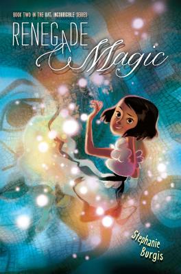
Here's an example. This is one of the covers I'm working on (I promise I won't fill this blog entry with my covers as examples!):

There is certainly no cat in this story (sorry to cat lovers!). But the illustration does represent the kind of magic in this story, and there is a scene at night with the boy and his uncle looking at the stars. It's a representative cover, not a strictly accurate one.
Avoid generic photos
It's really easy to find beautiful pictures of scenery (woodland, or impressive buildings, or stuff like that), but these rarely work as covers. They just don't jump out when a potential reader is skimming past, and they don't say anything about your book. Look for something unique and simple that stands out.I may be tiny, but I'm still cute
Thumbnails rule the world. If you're self-publishing an ebook, you are massively reliant on your cover being noticed on an online store. That means a thumbnail image on a search screen. You're talking about something maybe 100 by 160 pixels (or smaller, on something like the 'Customers who Bought This...' section). If your cover doesn't stand out or is difficult to figure out at that size, you won't be noticed.Traditionally published books are far less reliant on online stores. They have bookstores where their full-sized covers can be admired.
Check your cover at a width of 100px. If it doesn't work there, think again.
Don't attempt to composit multiple photos into a single image
Unless you're a Photoshop professional (and by this I mean someone who uses Photoshop to make a living, every day; using Photoshop at home or occasionally at work doesn't count), then don't attempt to make an image using multiple source photos. It will look bad, and it will be obvious.Compositing photos, particularly if you've first had to extract part of one image from a background, is really, really hard to do well enough. Even some commercial covers suffer from bad attempts at this.
Find a single piece of art or photo that works and use that.
You need space for text
This is a mistake I made on my first few covers.Look at any commercially-designed book cover and you'll notice one particular thing: there is plenty of space for text: the author's name, the book title, maybe quotes and a tag. The image (or the high impact part of the image, anyway), only fills part of the cover. Space has been deliberately left for the text.
Look at this cover:

There's a large white space at the bottom for the text. Or, more extreme:

Even where text is placed across an image, it should be over the least "busy" part of the image, as with this example:
Now, traditionally-published books have a big advantage: they generally commission original art or photography, or, where they use stock imagery, they generally use it to make a more complex piece. Unless you're an artist or a photoshop master, you don't really have that option. You need to use stock art, and stock art is not generally composed with book covers in mind; there is rarely space for text.
You have three options:
- Keep looking until you find stock art that does leave space for text and fits.
- Make room for text. Generally by extending the canvas to create space at the top or bottom (or, sometimes, the sides) as I did on my ebook cover above.
- Put the text over the image.
This third option is almost certainly the hardest, and if the image is complex, you're going to be almost out of luck. Which brings me to:
How to do text...
There are two things that, more than anything else, make an amateur cover stand out from a professionally-designed one. The first one, as I mentioned, is a botched attempt at compositing images. The second is the way the text looks on the cover.
Text is tough to do. You wouldn't think it would be, but it is. It's probably the hardest part of any design you do. The text has to stand out and be readable, ideally even at thumbnail size, but it also needs to be an integral part of the design; it's part of the artwork itself.
The key is simplicity. If you're using photoshop, or a similar program, you will be given a whole host of ways of manipulating it. Resist!
The more effects that you add to the text, the less it will feel like it's part of the cover, and the more amateurish it will seem.
- Flee for your life from the temptation to use satin, bevel and emboss effects.
- Be very cautious about using gradient or pattern overlays, inner glows and inner shadows.
The three effects you should familiarize yourself with are drop shadows, stroke, and outer glow. They can add life to your text without making it look like a horrible alien explosion on your cover.
But if you do use them, use them subtly. Don't go over the top. In most cases, someone giving your cover a casual glance shouldn't even notice they are there. They should be working in the background, almost invisible.
 |
| Someone Else's Fairytale uses drop shadows to help the text stand out from a complex image (as well as adding semi-transparent colors as backgrounds to the text) |
In many cases, though, you won't need them at all.
Black and White
It is very tempting, when you are starting out, to simply put white text on a black background (or vice versa) with no text effects. This rarely works for large text, unless you have a really excellent font. Try to avoid pure black and white together. Look for different colors, and some texture in the background, or work with outer glow to add dynamism.Choose a good font
Most of the fonts that come packaged on your computer won't work well for book covers. Standard text fonts, like Times New Roman, aren't designed for this. There are plenty of places online where you can find good-quality, free fonts. (Try www.fontsquirrel.com, for example.)Avoid fonts that are quirky, as well as handwriting or calligraphic fonts, unless you really know what you're doing. They are hard to work with. Look for something simple and elegant.
If all else fails, use Trajan Pro. It's clean, works beautifully at a large size, and it looks classy and professional.
 |
| Aerophilia uses Trajan Pro for its title (as does Someone Else's Fairytale, above). |
Okay, those are my tips so far. As always, there are exceptions to every rule, and an experienced designer can ignore any or all at will.
Update: Actually, that was eight tips. I may have studied higher mathematics, but I still can't count...
If you're interested in my ebook design services, you can see my portfolio and rates on my ebook design website.
16 comments:
I've been meaning to add, the covers for Someone Else's Fairytale and Aerophilia are by the enormously talented Jenn Reese at Tiger Bright Studios.
Patrick, a designer friend pointed your site out to show the great tips you have for designing ebook covers. I am very impressed with the beauty and professional quality of your work!
Thanks, Elise. I'm really glad you like them.
This is wonderful advice on book covers. Thank you for posting.
Great set of tips, I must say I agree with all of them. I also like your book designs a lot, keep it up! ;)
@ Igor@bookmockup
Thanks!
Thanks for the tips! They really help for a novice like me!
Might I add, I also have some Photoshop Actions to Create Ebook Covers free on my website. They're pretty easy to use without much knowledge of Photoshop. Anyone interested please have a look! Cheers guys!
As a designer I have to say these are excellent tips for non-professionals.
Honestly, this is some truly useful information.
"Your cover is a not an illustration of a scene from your book."
Every self-publishing author should be made to memorize that sentence.
This is very helpful, thank you! I've just been struggling on an ebook cover and I was stuck on tip 1, trying to make it a scene from my story.
Very helpful. Thank you fort he effort.
Excellent post full of useful tips, Patrick! I would just like to add that it's very important to realize that the thumbnail size of ebook covers imposes on you/requires/demands a visual simplification of the design!
Too many authors, especially self-published, go for a full image that actually only works at full size, I mean the size of a printed book cover. For ebook covers, it's highly advisable to go for the simplest possible design, yet the most striking, color-wise and pattern-wise. Even though it's tiny, you need to do something to arrest the wandering eyes of your (would-be) reader!
Absolutely right, Claude. For ebooks, the thumbnail is god.
i love this. the best advice i've received all day!!!!! God bless u patrick!
Thanks so much for this post. I've decided to design my own cover and didn't have much idea of where to start. I know *how* to do graphic design, but I don't know anything about the artistry behind it, especially not book covers specifically. This was helpful.
Post a Comment