It's amazing what budget 3D printers can do these days. Look at this one.
Sunday 14 May 2023
Phrozen Sonic Mini 8kS Review Vs Original Mini 8k - Cheaper and Better
Wednesday 3 May 2023
Thursday 18 April 2013
Today I have been mostly...
Today I have been mostly blogging on this group blog.
It's mainly an introduction blog entry, so if you already know me, you probably don't need to see it. If you don't already know me, well, hello!
Here's the blog entry.
It's mainly an introduction blog entry, so if you already know me, you probably don't need to see it. If you don't already know me, well, hello!
Here's the blog entry.
New cover: In the Morning Light, by Sarah Willoughby
This is just a quick blog post to show off a recent ebook cover I did:

Here's the blurb from Amazon:
In the Morning Light is a collection of stories inspired largely by time spent in the Middle East. It is made of the dreams of new brides, the love in older marriage, as well as the feelings of sadness, loss and hope in everyday life. This is the tale of seven couples:
A stagnant marriage.
A woman's need to be with her children again towards the end of her life.
A tale of hope in adverse circumstances.
A young woman married to an older man after her divorce.
A woman alone at the end of a marriage.
An idyllic marriage that may end too soon.
An affair.
You can find it at Amazon US | Amazon UK
Friday 29 March 2013
Cover Madness
Ever since I sold Secrets of the Dragon Tomb back in December, the thing I've been most ridiculously excited about is seeing the cover. Even more so than the interior illustrations (and you would not believe how excited I am about them...)
Now, I know that it's going to be ages until I've got a cover. The publisher has to hire an artist, work with them on what the cover is going to be, go through revisions, approvals, input from marketing and sales and so on and so on.
Thing is, I can't wait. I just can't.
Every time I take a look on goodreads, that sad blank, grey cover looks back at me, mocking me.
Well, I'm afraid I gave in.
I bought a rather nice image on a stock photo site, cropped it, and slapped some text on.
I was tempted to spend ages making it look like a real cover, but Steph quite sensibly gave me dire warnings about the confusion that it might cause.
So, it doesn't look like a real cover. But at least when I look at goodreads, I don't have that horrible blank giving me the evil eye.
And if you're on goodreads, feel free to add the book: http://www.goodreads.com/book/show/16172967-secrets-of-the-dragon-tomb ;)
Now, I know that it's going to be ages until I've got a cover. The publisher has to hire an artist, work with them on what the cover is going to be, go through revisions, approvals, input from marketing and sales and so on and so on.
Thing is, I can't wait. I just can't.
Every time I take a look on goodreads, that sad blank, grey cover looks back at me, mocking me.
Well, I'm afraid I gave in.
I bought a rather nice image on a stock photo site, cropped it, and slapped some text on.
 |
| Not the real cover... |
I was tempted to spend ages making it look like a real cover, but Steph quite sensibly gave me dire warnings about the confusion that it might cause.
So, it doesn't look like a real cover. But at least when I look at goodreads, I don't have that horrible blank giving me the evil eye.
And if you're on goodreads, feel free to add the book: http://www.goodreads.com/book/show/16172967-secrets-of-the-dragon-tomb ;)
Thursday 14 March 2013
Creating Your Ebook the Right Way: Part 5
You can read the previous parts of this Ebook conversion series here:


In the last part, we finally finished the lengthy process of cleaning up the Word document so that it could be converted to a flawless ebook.
And it was a lengthy process. Which is why, before I show you how to turn the Word document into an ebook, I want to take a quick moment to introduce you to a way of speeding the process up.
If you're likely to ever convert more than one ebook, it would be utterly crazy to plod through every step I've outlined, one at a time. You'd never get finished.
Which is why Macros were invented.
A Macro is simply a recording of bunch of actions that you take in Word. Here's what you do:
- Start to record a Macro.
- Carry out the formatting actions in exactly the same way that you normally would.
- Stop recording the Macro.
- Now, whenever you want to repeat those actions, you play the Macro, and Word carries out the actions automatically exactly the way you recorded them.
Sadly, Macros aren't suitable for every bit of the process of creating an ebook, otherwise this job would be trivial. But you can use them for the parts that you repeat over and over again in exactly the same way.
For example, remember when we converted all our bolds and italics into weird code? Then later we fixed some issues regarding spaces and line breaks in the weird code and converted back to bolds and italics? Those two processes would each make a good Macro. They were a pain to carry out, but the process for each will always be identical.
So, you'd record those two Macros, one at a time, and save them as something useful (such as 'ConvertBoldItalictoCode' and 'TidyUpandConvertBacktoBoldItalic'. Or whatever. In my version of Word, at least, you can't have any spaces in the names.)
Things that wouldn't be suitable for Macros:
- Removing multiple spaces and multiple line-breaks (because you have to repeat these actions until you get no more replacements)
- Copying your text from Word to a text editor and back again (because those actions don't only use Word)
- Searching for and fixing apostrophes at the beginning of words (because you need to confirm these manually).
Hopefully, you can go through and figure out what you can save as a Macro and what you can't.
Recording a Macro
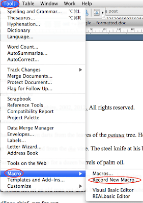
Go to Tools > Macro > Record New Macro...

Enter a name for your Macro (no spaces!) and hit OK.
You'll know the Macros is recording because you'll see a little thingy pop up with pause and stop option. Now just go ahead and carry out the formatting actions exactly as you want them to happen.
To stop recording the Macro, just press the stop button.
As usual, expect this to look slightly different on your version of Word. But you'll have the facility in there.
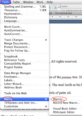
How to Run a Macro
Go to Tools > Macro > Macros...

Choose the Macro from the list. Click Run. It will now perform all the actions you've recorded in a tiny fraction of the time.

Learn how and when to use Macros, and they'll save you hours.
That's it! Next time out, we'll actually be making the ebook, and all this will seem worthwhile.
Friday 8 March 2013
Creating Your Ebook the Right Way: Part 4
This is a series of blog posts teaching you how to convert a manuscript (novel / short story / story collection) into an ebook suitable for selling through all the major ebook stores. You can find the previous parts here:
Part 1 | Part 2 | Part 3
Apologies for the delay in getting to this latest instalment. Too busy working! But we're back.
So, last time I left you, we'd just finished clearing out all the extraneous junk that had crept into our Word document when we'd written our story. We've got a few more things to do in Word before we head over and turn this into an ebook.
We need to make sure that the punctuation turns out the way we expect it when we get to the ebook. The things we're going to cover today are:

When the Symbol dialog box is open, select the ellipsis symbol and click on insert.
Now, many of you will have set up Word to automatically convert three periods into an ellipsis when you type your book (look under Tools > AutoCorrect), and you may think that means that Word will have sorted it out already. Well, in most cases it will, but in a few cases, it won't have. You can't rely on it 100%, so follow this easy step and you'll know you've got it right.
There are basically three types of punctuation mark that look like dashes. The hyphen (-), the en dash (–) and the m dash (—).
The hyphen is used to, well, hyphenate words. For example:
The en dash is used when stating a range of time, and it is used to replace the word 'to'. For example,
For example:
Unfortunately, the only type of dash that you'll see on your keyboard is the hyphen. When we're writing, most of us use the hyphen to represent both the hyphen and the en dash, and use two hyphens (--) to represent the em dash.
The en dash is rare enough that you can go through and replace instances manually, if you need to (although many authors don't bother, and these is one of the cases where I think it really doesn't matter that much; punctuation police may disagree, but the visual distinction is slight, and you won't use en dash very often in most cases).
So, what you really need to do is deal with em dashes.
We're going to do this in exactly the same way as the ellipses.
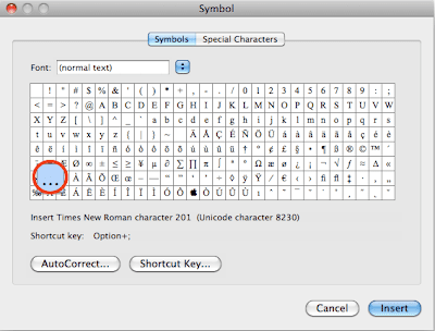
In a blank Word document, go to Insert > Symbol. In the 'Symbol' dialogue box, choose 'Special Characters'. Click on Em dash and then Insert.

Copy the em dash symbol, return to your main document, and Find and Replace the double hyphen (or whatever you use) with the em dash symbol you copied.
Our final bit to fix up is the inverted commas (quotation marks) and apostrophes.
Typographical purists will tell you that an apostrophe is not the same thing as a single inverted comma. While this is true, they are as close to identical in appearance as to make no real difference, and I'm going to treat them as the same. If you want to use different typographical marks for them, good luck to you. Life's too short...
Rather like em dashes or ellipses, most keyboards do not have individual keys for left and right inverted commas. This means that, by default, when you type you get straight, rather than curly, inverted commas and apostrophes. (The ones you'll see reading this blog post are straight). These are, to be frank, a bit crappy and amateur-looking. We want curly ones.
Which is why word processors, such as Word, have smart quotes functionality, which automatically replaces the straight quotes with curly ones.
We can leverage this very helpful behaviour to make sure we've got curly quotes. (Chances are you already do, but just in case, let's run through how to get them with your completed document.)

Again, different versions of Word have things in slightly different places, but the options are always there.
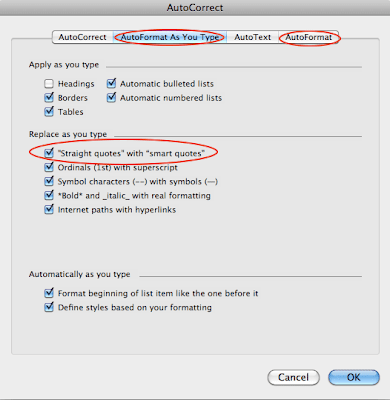
There are two tabs you want to look at. 'AutoFormat as You Type' and 'AutoFormat'. In both cases, make sure that the "Straight quotes" with "smart quotes" option is checked. Click OK.
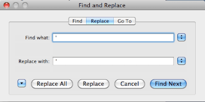
Now, all you need to do is go back to Find and Replace.
In the Find box type a double (straight) quotation mark. In the Replace box, type exactly the same quotation mark. Now click 'Replace All'.
Every time a quotation mark is replaced, the AutoFormat will kick in and insert the correct left or right curly quote.
Do exactly the same with single straight quotation marks in both Find and Replace boxes.
Now you've got lovely curly quotes everywhere.
In 90% of the cases, your curly quotes will be lovely. But there is one problem. If you have an apostrophe at the beginning of a word, for example:
If you want to fix them, here's what you need to do. Go to the two AutoFormat tabs (see above) and uncheck the "straight quotes" with "smart quotes" option in both.
Once again, in a blank Word document, go to Insert > Symbol and insert a single right curly quote ( ’ ). Copy it and head back to the main document.

Go to Find and Replace. In the Find box, hit the space bar then type a single straight quote. In the Replace box, hit the space bar then paste the single right curly quote in there.
Unfortunately, you can't do everything automatically, and this is one of the times where you've just got to get your hands dirty. If you click Replace All, then you will also replace any opening single inverted commas that you might need.
If you know for sure that you don't need any opening single inverted commas, then Replace All. Otherwise, you'll need to go through one at a time by clicking Find Next and checking each to see if you want to replace it.
When you've done that, you'll need to do the same with any of these apostrophes that come at the beginning of a line. In the Find box, type ^p followed by a straight single quote. In the Replace box, type ^p and paste in the single right curly quote. Again, replace each individually where you need to.

That's it.
Now, you've fixed all of the formatting issues you might need to. You're ready to create a perfect Word document to upload to Smashwords or Amazon, or to create a proper ebook in epub and mobi format. That's what we're going to be doing next.
See you then!
Part 5 is now available: read part 5 here.
Part 1 | Part 2 | Part 3
Apologies for the delay in getting to this latest instalment. Too busy working! But we're back.
So, last time I left you, we'd just finished clearing out all the extraneous junk that had crept into our Word document when we'd written our story. We've got a few more things to do in Word before we head over and turn this into an ebook.
The few more things
We need to make sure that the punctuation turns out the way we expect it when we get to the ebook. The things we're going to cover today are:
- ellipses
- em dashes and hyphens
- inverted commas and apostrophes
This is a much shorter process than the one I covered in the last part.
Ellipses
If you don't know what an ellipsis is, it looks like three dots, and it's used to show where a word or words is omitted from a sentence. Basically, this is it:
…
It is also used to indicate a pause or the trailing off of a sentence.
…
It is also used to indicate a pause or the trailing off of a sentence.
For example,
"I'm … not sure," he said.
When most of us type this while writing, we tend just to hit the period (full stop) key three times.
However, an ellipsis isn't generally just three periods (full stops) one after another. It's actually a single typesetting mark.
The problem with using three periods is that they may end up being split over the end of a line, and that looks pretty unprofessional. To avoid that, we are going to replace the periods with a proper ellipsis.
First, though, you need to check how you are actually typing the ellipsis. Like I said, most people just hit the period key three times, but some people leave spaces between the periods, and you may have your own way of doing it.
So, how do we get the ellipses?
First, we need to find an ellipsis symbol. This is fairly easy to do.
Open a blank document. Then go to the 'Insert' menu and click on 'Symbol...'. (Standard disclaimer: your version of Word may look a bit different, but they option will be fairly easy to find.)
When the Symbol dialog box is open, select the ellipsis symbol and click on insert.

You now have an ellipsis symbol in the document. Copy it.
Now, go back to the document you are formatting. Select 'Replace...' (Edit > Replace... in the menus).
Now, go back to the document you are formatting. Select 'Replace...' (Edit > Replace... in the menus).
In the 'Find what' box, type in whatever you use to represent an ellipsis when typing. For example, three periods.
In the 'Replace with' box, just paste the ellipsis symbol you have just copied.
Click Replace All.
Done!
Click Replace All.
Done!
Now, many of you will have set up Word to automatically convert three periods into an ellipsis when you type your book (look under Tools > AutoCorrect), and you may think that means that Word will have sorted it out already. Well, in most cases it will, but in a few cases, it won't have. You can't rely on it 100%, so follow this easy step and you'll know you've got it right.
Em dashes and hyphens
There are basically three types of punctuation mark that look like dashes. The hyphen (-), the en dash (–) and the m dash (—).
The hyphen is used to, well, hyphenate words. For example:
The well-known author.(Full rules on when to use a hyphen.)
The en dash is used when stating a range of time, and it is used to replace the word 'to'. For example,
1939–1945The em dash is used as a form of parenthesis or to indicate the abrupt change of thought. In dialogue, we often use it to show a sentence abruptly cut off.
For example:
"I'm never going to—"Or:
I thought—I really did—that this would soon be over.(Full rules on when to use en and em dashes.)
Unfortunately, the only type of dash that you'll see on your keyboard is the hyphen. When we're writing, most of us use the hyphen to represent both the hyphen and the en dash, and use two hyphens (--) to represent the em dash.
The en dash is rare enough that you can go through and replace instances manually, if you need to (although many authors don't bother, and these is one of the cases where I think it really doesn't matter that much; punctuation police may disagree, but the visual distinction is slight, and you won't use en dash very often in most cases).
So, what you really need to do is deal with em dashes.
We're going to do this in exactly the same way as the ellipses.
In a blank Word document, go to Insert > Symbol. In the 'Symbol' dialogue box, choose 'Special Characters'. Click on Em dash and then Insert.

Copy the em dash symbol, return to your main document, and Find and Replace the double hyphen (or whatever you use) with the em dash symbol you copied.
Inverted commas and apostrophes
Our final bit to fix up is the inverted commas (quotation marks) and apostrophes.
Typographical purists will tell you that an apostrophe is not the same thing as a single inverted comma. While this is true, they are as close to identical in appearance as to make no real difference, and I'm going to treat them as the same. If you want to use different typographical marks for them, good luck to you. Life's too short...
Rather like em dashes or ellipses, most keyboards do not have individual keys for left and right inverted commas. This means that, by default, when you type you get straight, rather than curly, inverted commas and apostrophes. (The ones you'll see reading this blog post are straight). These are, to be frank, a bit crappy and amateur-looking. We want curly ones.
Which is why word processors, such as Word, have smart quotes functionality, which automatically replaces the straight quotes with curly ones.
We can leverage this very helpful behaviour to make sure we've got curly quotes. (Chances are you already do, but just in case, let's run through how to get them with your completed document.)
Go to the Tools menu, then choose 'AutoCorrect...', like so:
Again, different versions of Word have things in slightly different places, but the options are always there.
There are two tabs you want to look at. 'AutoFormat as You Type' and 'AutoFormat'. In both cases, make sure that the "Straight quotes" with "smart quotes" option is checked. Click OK.

Now, all you need to do is go back to Find and Replace.
In the Find box type a double (straight) quotation mark. In the Replace box, type exactly the same quotation mark. Now click 'Replace All'.
Every time a quotation mark is replaced, the AutoFormat will kick in and insert the correct left or right curly quote.
Do exactly the same with single straight quotation marks in both Find and Replace boxes.
Now you've got lovely curly quotes everywhere.
A problem
In 90% of the cases, your curly quotes will be lovely. But there is one problem. If you have an apostrophe at the beginning of a word, for example:
Go get ‘em.Or:
Back in ‘45.The AutoFormat will have replaced it with a left single curly quote, as you can see above, while all other apostrophes will be right single curly quotes, like this:
Don’t do it like that. Do it like this.If you have these incorrect apostrophes at the beginning of words, you have two choices. You can either leave them the way they are and not care much, or you can fix them.
If you want to fix them, here's what you need to do. Go to the two AutoFormat tabs (see above) and uncheck the "straight quotes" with "smart quotes" option in both.
Once again, in a blank Word document, go to Insert > Symbol and insert a single right curly quote ( ’ ). Copy it and head back to the main document.

Go to Find and Replace. In the Find box, hit the space bar then type a single straight quote. In the Replace box, hit the space bar then paste the single right curly quote in there.

Unfortunately, you can't do everything automatically, and this is one of the times where you've just got to get your hands dirty. If you click Replace All, then you will also replace any opening single inverted commas that you might need.
If you know for sure that you don't need any opening single inverted commas, then Replace All. Otherwise, you'll need to go through one at a time by clicking Find Next and checking each to see if you want to replace it.
When you've done that, you'll need to do the same with any of these apostrophes that come at the beginning of a line. In the Find box, type ^p followed by a straight single quote. In the Replace box, type ^p and paste in the single right curly quote. Again, replace each individually where you need to.

That's it.
Now, you've fixed all of the formatting issues you might need to. You're ready to create a perfect Word document to upload to Smashwords or Amazon, or to create a proper ebook in epub and mobi format. That's what we're going to be doing next.
See you then!
Part 5 is now available: read part 5 here.
Thursday 28 February 2013
Cover Case Study: Dueling Magics, by Stephanie Burgis
Occasionally, when I put together a new ebook cover for a client, I like to give a little bit of insight as to how it came about what I did to make it, for those of you designing your own covers.
My latest cover is for a short story called Dueling Magics, by Stephanie Burgis, and here it is:
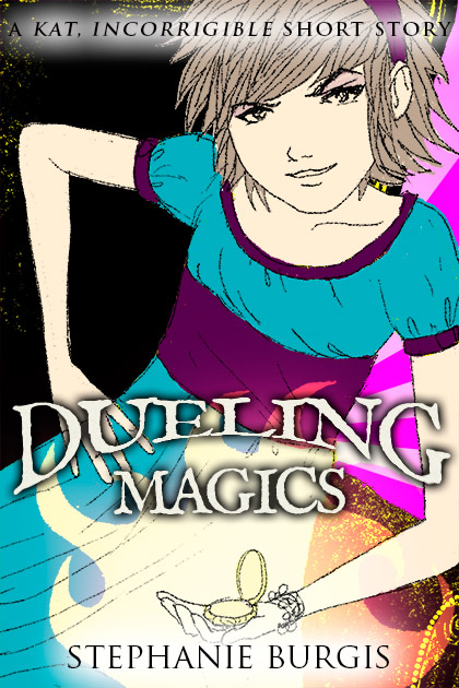
Dueling Magics is a short story set in the time between two of Steph's novels, Kat, Incorrigible and Renegade Magic (published in the U.K. as A Most Improper Magick and A Tangle of Magicks).
The Kat, Incorrigible books are middle-grade magical adventures in Regency Britain, with lots of humour and romance (for the older characters). Kat is a fantastically sparky, headstrong heroine for the series, and it was important to show that in the cover.
Very luckily (for me), back when Steph's first book was being prepared for publication, the publisher commissioned a beautiful cover by artist Barnaby Ward, but they eventually decided to go with a different style with the cover. This was the original cover:
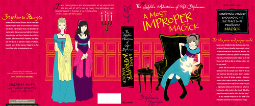
Barnaby Ward was kind enough to allow Steph to re-use this artwork for her short story.
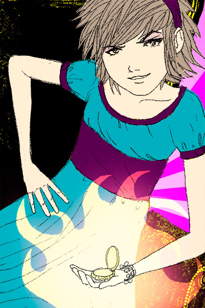
Now, we could simply have chosen to take the front cover of this and change the title, leaving us with a fantastic cover.
But, the cover was designed primarily for a print book that would be in bookstores, where it could be picked up and examined at full size, with all the texture and weight of a print book. Dueling Magics is an ebook, and with ebooks, the thumbnail is absolute king. I wanted the cover to have more impact at thumbnail size.
The solution was pretty simple: zoom in on Kat. After all, Kat is the absolute centre of the story. The artist has captured her perfectly.
So, that was what I did. I cropped the image right in close. (I also changed the background, although now you don't see so much of it.)
Now that image really pops:
Okay, but it's not done. We need the text.
Ideally, with a cover, you want a fairly blank space to add the title and author. We don't have any completely blank spaces that are large enough here, but that's okay. The focus points of the image are Kat's face and her magic mirror. We need to leave these clear, but otherwise, we've essentially got blank space.
We also need to consider where we want to draw the eye on the cover. Well, the most important bits are going to be (probably in this order): the title, Kat's face, the author's name, the series title, and the magic mirror.
I've designed the text to make this emphasis work.
Now, I've talked before about the need for subtlety in the effects you add to the text on covers. In general, you don't want to go for enormous drop-shadows, outlines, colour gradients, outer glows and so on. Except when you do.
In this case, we're dealing with a middle-grade story. That's for readers who are anywhere between about 9 years old to 12 years old (or a year or two on either side). Subtlety is a lot less important in that group. In fact, it can actually be a disadvantage.
Things need more impact for this age range. Strong colours and big effects are what appeal to them.
But... it should probably go without saying that you need to do these well, or it'll be a disaster.
Here's how I chose to actually use the text in the final image:
As you can see, I've chosen a pretty heavy effect on both the book title and the series title, to make them stand out against their backgrounds and (for the story title) to pop out of the page.
Take a look at some commercial middle grade covers (particularly in the younger middle-grade range) and you'll see the designers following the same principles.
By the way, if you want a copy of Dueling Magics, right now it's free as an ebook in all formats on Smashwords (for now, at least). If you prefer to use Amazon to get your ebooks, the story is available on Amazon.com and Amazon.co.uk (as well as the other Amazon international stores), although it isn't free there (but it is the cheapest possible price; Amazon doesn't usually allow authors to make their stories free on Amazon).
Enjoy the cover, but much more importantly, enjoy the story!
My latest cover is for a short story called Dueling Magics, by Stephanie Burgis, and here it is:
Dueling Magics is a short story set in the time between two of Steph's novels, Kat, Incorrigible and Renegade Magic (published in the U.K. as A Most Improper Magick and A Tangle of Magicks).
The Kat, Incorrigible books are middle-grade magical adventures in Regency Britain, with lots of humour and romance (for the older characters). Kat is a fantastically sparky, headstrong heroine for the series, and it was important to show that in the cover.
Very luckily (for me), back when Steph's first book was being prepared for publication, the publisher commissioned a beautiful cover by artist Barnaby Ward, but they eventually decided to go with a different style with the cover. This was the original cover:
Barnaby Ward was kind enough to allow Steph to re-use this artwork for her short story.
Now, we could simply have chosen to take the front cover of this and change the title, leaving us with a fantastic cover.
But, the cover was designed primarily for a print book that would be in bookstores, where it could be picked up and examined at full size, with all the texture and weight of a print book. Dueling Magics is an ebook, and with ebooks, the thumbnail is absolute king. I wanted the cover to have more impact at thumbnail size.
The solution was pretty simple: zoom in on Kat. After all, Kat is the absolute centre of the story. The artist has captured her perfectly.
So, that was what I did. I cropped the image right in close. (I also changed the background, although now you don't see so much of it.)
Now that image really pops:
Okay, but it's not done. We need the text.
Ideally, with a cover, you want a fairly blank space to add the title and author. We don't have any completely blank spaces that are large enough here, but that's okay. The focus points of the image are Kat's face and her magic mirror. We need to leave these clear, but otherwise, we've essentially got blank space.
We also need to consider where we want to draw the eye on the cover. Well, the most important bits are going to be (probably in this order): the title, Kat's face, the author's name, the series title, and the magic mirror.
I've designed the text to make this emphasis work.
Now, I've talked before about the need for subtlety in the effects you add to the text on covers. In general, you don't want to go for enormous drop-shadows, outlines, colour gradients, outer glows and so on. Except when you do.
In this case, we're dealing with a middle-grade story. That's for readers who are anywhere between about 9 years old to 12 years old (or a year or two on either side). Subtlety is a lot less important in that group. In fact, it can actually be a disadvantage.
Things need more impact for this age range. Strong colours and big effects are what appeal to them.
But... it should probably go without saying that you need to do these well, or it'll be a disaster.
Here's how I chose to actually use the text in the final image:
As you can see, I've chosen a pretty heavy effect on both the book title and the series title, to make them stand out against their backgrounds and (for the story title) to pop out of the page.
Take a look at some commercial middle grade covers (particularly in the younger middle-grade range) and you'll see the designers following the same principles.
By the way, if you want a copy of Dueling Magics, right now it's free as an ebook in all formats on Smashwords (for now, at least). If you prefer to use Amazon to get your ebooks, the story is available on Amazon.com and Amazon.co.uk (as well as the other Amazon international stores), although it isn't free there (but it is the cheapest possible price; Amazon doesn't usually allow authors to make their stories free on Amazon).
Enjoy the cover, but much more importantly, enjoy the story!
Friday 8 February 2013
Creating Your Ebook the Right Way: Part 3
This is part 3 in my series of blog posts about how to turn your novel / short story / collection of stories into an ebook suitable to be sold in all the main ebook stores, such as Barnes and Noble, Amazon, Smashwords, Kobo, Apple iStore and the like.
If you missed the first two parts, you can find them here: Part 1 | Part 2.
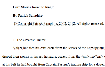
When we last left off, we had just wiped out all of the formatting from our Word document and copied it into a text editor, such as Notepad. Here's what my document looks like in the text editor:
I'm using a code editor called 'Sublime Text 2' for my text editor, which is more high-powered than you need right here. (I use it because it's what I use for other things, like website development. You will be fine at this stage if you're using Notepad or TextEdit.)
Now that we've got the text in a text editor, we've effectively removed all of the crud that we managed to fill it with when we first wrote our story in Word. But we still need to tidy it up, and then, if we're going to upload a Word document to Smashwords or Amazon, or if we're going to create a PDF version of our ebook, we're going to have to reformat it all.
That means going back to Word again.
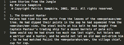
Just a glance at the story I'm formatting shows that it's still a bit messy. For instance, there's a space before the © symbol, and a blank line after the copyright line. We don't want those.
At which point, you might be saying, "Huh? Don't want blank lines? Won't that make everything look crap?*" (*You may choose not to swear, of course.)
Well, it would. Except blank lines can make a real mess of ebooks. Smashwords suggest that you don't have more than four paragraph returns (four presses of the 'Enter' key) to create space. I'm going to go further: don't have any at all. We have a far better way of creating the space we need, and we'll come to that later.
Right now, we're going to get rid of all the unnecessary stuff like extra spaces and blank lines, and do some other tidying-up and conversion at the same time.
At this point, I should note that Smashwords has an excellent and thorough guide for formatting documents for Smashwords. If you are going to upload a Word document to Smashwords, you should familiarise yourself thoroughly with it.
But we want to do more here. We want Word versions for Smashwords and Amazon, and we also want epub and mobi versions, so we'll go about things a little differently.
First thing, though, is to get back to Word.
Open a brand-new, blank document in Word.
Copy all the text from your text editor, and paste it into the blank Word document. Now save it.
It should look something like this, depending on how your blank template is set up in Word (mine has double line spacing and indented paragraphs; yours may be different; it doesn't really matter at this stage):
Right now, it probably doesn't look much different from the way it did when you last had it in Word, which might make the process seem a little redundant. But you can be absolutely sure now that there are no lingering, ugly bits of formatting that would mess you up at a later stage.
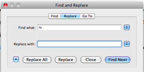
Some people indent their paragraphs using the 'tab' key. Even if you don't usually, there might still be a few places where you've done that.
The process we've followed so far won't have got rid of your tabs, and we don't want them in our ebooks, so let's get rid of them first.
Open up the 'Replace' function in Word. In the Find box, type exactly this:
^t
The Replace box should be completely empty.
Make sure you don't have any formatting options, like bold or italic, still set in these boxes from earlier in the process. If you do, clear that formatting first.
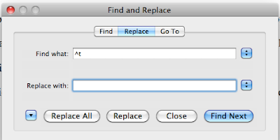
Click 'Replace All'.
Your tabs should now all be gone.
Next up, we want to get rid of any extra spaces that we've got. These might be at the beginning or end of lines, or you may be in the habit of typing two spaces after a full-stop (period). Maybe you use spaces to indent your paragraphs. Or you might just have stuck some in by mistake or to space things out.
Whichever, we don't want them. Not in ebooks.
Multiple spaces
First, we'll get rid of any multiple spaces.
Again, go to 'Replace' in Word.
Make sure there's nothing at all in either the Find or Replace boxes. No formatting. No typing. Nothing. Put your cursor in each of the boxes in turn and delete anything in there.
Now, go to the Find box and hit the space bar twice.
Then, to go the Replace box and hit the space bar once.
Click on 'Replace All'.
You may well have to do this several times. Keep going until Word finds nothing more to replace. I had to do it three times with the document I'm working with before Word said it found 0 replacements.
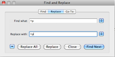
Spaces at the end of lines
In general, spaces at the end of lines won't cause you too many problems, because they'll be ignored. But to be really sure, let's get rid of them anyway. It won't take long.
'Replace' is your friend again.
As before, make sure there's absolutely nothing typed in the Find or Replace boxes, and no formatting.
In the Find box, hit the spacebar once, then type the following exactly:
^p
In the Replace box, type the following exactly (without any spaces):
^p
So:
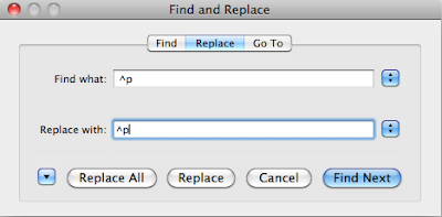
Then click 'Replace All'. The ^p that you typed is the symbol for a paragraph return in Word. We are searching the Word document for any paragraph return that is preceded by a space, and then we are replacing it with just the paragraph return, sans spaces.
Spaces at the beginning of lines
More important are the spaces at the beginning of lines, like the one I've got at the beginning of the copyright statement. These will make a mess of your formatting. The procedure is very similar.
Go to 'Replace'.
Clear out everything that's in there, including spaces.
In the Find box, type ^p and hit the spacebar once.
In the Replace box, type ^p without any spaces.
Click 'Replace All'.
I had a lot of these spaces at the beginning of lines. (Tut-tut!). Now I have none. (Yay!)
This time, we are searching for any paragraph returns that are immediately followed by a space (at the beginning of the new paragraph), and we are replacing them with just the paragraph return. No space.
Remember we don't want blank lines either. So, we're going to get rid of them.
The way we do this is, as usual, with 'Replace'. Open up the Replace function in Word. In the Find box, type exactly this:
^p^p
In the Replace box, type exactly this:
^p
Like so:

Replace All.
Remember, the ^p that you typed is the symbol for a paragraph return. Twice means that there are two paragraph returns, one directly after the other, which means a blank line. We replace the two paragraph returns with a single one.
You need to repeat this process until there are no more results of the Find and Replace. If you've used a lot of paragraph returns at various points, this might take a few goes.
When you're done, have a quick scroll through your document. There shouldn't be any blank lines anywhere.
If there are any, and you've followed all of this, that probably means there's some other formatting in the way. Click on the show / hide formatting symbol in the toolbar on Word. It looks like this:

Scroll through and look at the formatting. Paragraph returns are shown with the above symbol. If you have two together anywhere, just manually delete one.
Hopefully, you won't have to do that. I find that my version of Word makes me do this if there are two paragraph returns right at the end of the document. Who knows why?
Now, you'll recall that we replaced our italics with placeholders, so that we could easily reinsert them. Everything that should be italic starts with <em> and ends with </em> (or whatever other placeholder you chose. We need to reverse that.
But first, we're going to tidy up any poor formatting around the italics.
We want to make sure that the text and only the text (and any spaces in between words) are italicised. For example, we want to make sure that no spaces at the beginning or end of the italicised text are also included. And we want to make sure the paragraph returns aren't within the italics. Doing this will mean that, when we convert to epub later on, there are fewer issues to deal with.
We're going to use Find and Replace again, of course.
First up, in the Find box type the following:
<em> and then hit the spacebar.
In the Replace box, hit the spacebar then type the following:
<em>
Replace All.
Next, in the Find box hit the spacebar then type:
</em>
In the Replace box type:
</em> then hit the spacebar.
Replace All.
Now the line breaks.
In the Find box, type:
^p</em>
In the Replace box, type:
</em>^p
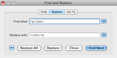
Replace All.
And finally...
In the Find Box, type:
<em>^p
In the Replace Box type:
^p<em>
Replace All.
Phew. That was kind of exhausting.
Now do exactly the same with bold. (Remembering that we used <strong> and </strong> to wrap the bold text.)
We've tidied up the italics, but now we actually have to turn them into italics again. This may appear a little more complex, but it's really quite easy. Just type exactly what I show, and it'll work.
As usual, go to 'Replace' in Word.
In the Find box, type exactly this:
\<em\>*\</em\>
Click on the down arrow (if you haven't already) to show the further options. Click on the 'Use wildcards' checkbox, to make sure it is checked. (Remember, your version of Word may do this differently, but you'll be able to select 'Use wildcards' as an option somehow. Use your 'help' button if necessary.)
In the Replace box, type exactly this:
^&
Still in the Replace box, choose 'Font' from the 'Format' dropdown, and then click on Italic and OK.

Replace All
The appropriate parts of the manuscript should now be italicised. You'll note, though, that we still have the <em> and </em> markers:

Good old Find and Replace will sort that out.
In the Find box, type:
<em>
In the Replace box, clear the formatting (click the 'No formatting' button, or similar) and delete everything that is in the box, so it is blank (not even spaces).
Replace All.
Do the same, but with </em> in the Find box.
Sorted. You now have italics back, without any errors at all in the formatting.
You need to do the same with bold. You can probably figure out how. (Hint: in the Find box, you'll be typing: \<strong\>*\</strong\> ).
There's some more tidying up to do before we style this document, but this has been a long entry, so let's leave if for next time.
If you're getting stuck or confused, feel free to ask questions in the comments!
Part 4 is now available: read part 4 here.
(Note: if you are interested in hiring me for ebook cover design or ebook formatting, you can see samples of my work here: http://www.50secondsnorth.com/ebooks/ and see details (including cost) of my services here: http://www.50secondsnorth.com/ebooks/details-rates.html)
If you missed the first two parts, you can find them here: Part 1 | Part 2.
When we last left off, we had just wiped out all of the formatting from our Word document and copied it into a text editor, such as Notepad. Here's what my document looks like in the text editor:

I'm using a code editor called 'Sublime Text 2' for my text editor, which is more high-powered than you need right here. (I use it because it's what I use for other things, like website development. You will be fine at this stage if you're using Notepad or TextEdit.)
Now that we've got the text in a text editor, we've effectively removed all of the crud that we managed to fill it with when we first wrote our story in Word. But we still need to tidy it up, and then, if we're going to upload a Word document to Smashwords or Amazon, or if we're going to create a PDF version of our ebook, we're going to have to reformat it all.
That means going back to Word again.
Tidying up
Just a glance at the story I'm formatting shows that it's still a bit messy. For instance, there's a space before the © symbol, and a blank line after the copyright line. We don't want those.
At which point, you might be saying, "Huh? Don't want blank lines? Won't that make everything look crap?*" (*You may choose not to swear, of course.)
Well, it would. Except blank lines can make a real mess of ebooks. Smashwords suggest that you don't have more than four paragraph returns (four presses of the 'Enter' key) to create space. I'm going to go further: don't have any at all. We have a far better way of creating the space we need, and we'll come to that later.
Right now, we're going to get rid of all the unnecessary stuff like extra spaces and blank lines, and do some other tidying-up and conversion at the same time.
At this point, I should note that Smashwords has an excellent and thorough guide for formatting documents for Smashwords. If you are going to upload a Word document to Smashwords, you should familiarise yourself thoroughly with it.
But we want to do more here. We want Word versions for Smashwords and Amazon, and we also want epub and mobi versions, so we'll go about things a little differently.
First thing, though, is to get back to Word.
Open a brand-new, blank document in Word.
Copy all the text from your text editor, and paste it into the blank Word document. Now save it.
It should look something like this, depending on how your blank template is set up in Word (mine has double line spacing and indented paragraphs; yours may be different; it doesn't really matter at this stage):

Right now, it probably doesn't look much different from the way it did when you last had it in Word, which might make the process seem a little redundant. But you can be absolutely sure now that there are no lingering, ugly bits of formatting that would mess you up at a later stage.
Tabs
Some people indent their paragraphs using the 'tab' key. Even if you don't usually, there might still be a few places where you've done that.
The process we've followed so far won't have got rid of your tabs, and we don't want them in our ebooks, so let's get rid of them first.
Open up the 'Replace' function in Word. In the Find box, type exactly this:
^t
The Replace box should be completely empty.
Make sure you don't have any formatting options, like bold or italic, still set in these boxes from earlier in the process. If you do, clear that formatting first.
Your Find and Replace should look like this:
Click 'Replace All'.
Your tabs should now all be gone.
Extra spaces
Next up, we want to get rid of any extra spaces that we've got. These might be at the beginning or end of lines, or you may be in the habit of typing two spaces after a full-stop (period). Maybe you use spaces to indent your paragraphs. Or you might just have stuck some in by mistake or to space things out.
Whichever, we don't want them. Not in ebooks.
Multiple spaces
First, we'll get rid of any multiple spaces.
Again, go to 'Replace' in Word.
Make sure there's nothing at all in either the Find or Replace boxes. No formatting. No typing. Nothing. Put your cursor in each of the boxes in turn and delete anything in there.
Now, go to the Find box and hit the space bar twice.
Then, to go the Replace box and hit the space bar once.
Click on 'Replace All'.
You may well have to do this several times. Keep going until Word finds nothing more to replace. I had to do it three times with the document I'm working with before Word said it found 0 replacements.
Spaces at the end of lines
In general, spaces at the end of lines won't cause you too many problems, because they'll be ignored. But to be really sure, let's get rid of them anyway. It won't take long.
'Replace' is your friend again.
As before, make sure there's absolutely nothing typed in the Find or Replace boxes, and no formatting.
In the Find box, hit the spacebar once, then type the following exactly:
^p
In the Replace box, type the following exactly (without any spaces):
^p
So:

Then click 'Replace All'. The ^p that you typed is the symbol for a paragraph return in Word. We are searching the Word document for any paragraph return that is preceded by a space, and then we are replacing it with just the paragraph return, sans spaces.
Spaces at the beginning of lines
More important are the spaces at the beginning of lines, like the one I've got at the beginning of the copyright statement. These will make a mess of your formatting. The procedure is very similar.
Go to 'Replace'.
Clear out everything that's in there, including spaces.
In the Find box, type ^p and hit the spacebar once.
In the Replace box, type ^p without any spaces.

Click 'Replace All'.
I had a lot of these spaces at the beginning of lines. (Tut-tut!). Now I have none. (Yay!)
This time, we are searching for any paragraph returns that are immediately followed by a space (at the beginning of the new paragraph), and we are replacing them with just the paragraph return. No space.
Blank lines
Remember we don't want blank lines either. So, we're going to get rid of them.
The way we do this is, as usual, with 'Replace'. Open up the Replace function in Word. In the Find box, type exactly this:
^p^p
In the Replace box, type exactly this:
^p
Like so:

Replace All.
Remember, the ^p that you typed is the symbol for a paragraph return. Twice means that there are two paragraph returns, one directly after the other, which means a blank line. We replace the two paragraph returns with a single one.
You need to repeat this process until there are no more results of the Find and Replace. If you've used a lot of paragraph returns at various points, this might take a few goes.
When you're done, have a quick scroll through your document. There shouldn't be any blank lines anywhere.
If there are any, and you've followed all of this, that probably means there's some other formatting in the way. Click on the show / hide formatting symbol in the toolbar on Word. It looks like this:
Scroll through and look at the formatting. Paragraph returns are shown with the above symbol. If you have two together anywhere, just manually delete one.
Hopefully, you won't have to do that. I find that my version of Word makes me do this if there are two paragraph returns right at the end of the document. Who knows why?
Sorting out italics
Now, you'll recall that we replaced our italics with placeholders, so that we could easily reinsert them. Everything that should be italic starts with <em> and ends with </em> (or whatever other placeholder you chose. We need to reverse that.
But first, we're going to tidy up any poor formatting around the italics.
We want to make sure that the text and only the text (and any spaces in between words) are italicised. For example, we want to make sure that no spaces at the beginning or end of the italicised text are also included. And we want to make sure the paragraph returns aren't within the italics. Doing this will mean that, when we convert to epub later on, there are fewer issues to deal with.
We're going to use Find and Replace again, of course.
First up, in the Find box type the following:
<em> and then hit the spacebar.
In the Replace box, hit the spacebar then type the following:
<em>
Replace All.
Next, in the Find box hit the spacebar then type:
</em>
In the Replace box type:
</em> then hit the spacebar.
Replace All.
Now the line breaks.
In the Find box, type:
^p</em>
In the Replace box, type:
</em>^p

Replace All.
And finally...
In the Find Box, type:
<em>^p
In the Replace Box type:
^p<em>
Replace All.
Phew. That was kind of exhausting.
Now do exactly the same with bold. (Remembering that we used <strong> and </strong> to wrap the bold text.)
Getting back the italics
We've tidied up the italics, but now we actually have to turn them into italics again. This may appear a little more complex, but it's really quite easy. Just type exactly what I show, and it'll work.
As usual, go to 'Replace' in Word.
In the Find box, type exactly this:
\<em\>*\</em\>
Click on the down arrow (if you haven't already) to show the further options. Click on the 'Use wildcards' checkbox, to make sure it is checked. (Remember, your version of Word may do this differently, but you'll be able to select 'Use wildcards' as an option somehow. Use your 'help' button if necessary.)
In the Replace box, type exactly this:
^&
Still in the Replace box, choose 'Font' from the 'Format' dropdown, and then click on Italic and OK.

Replace All
The appropriate parts of the manuscript should now be italicised. You'll note, though, that we still have the <em> and </em> markers:

Good old Find and Replace will sort that out.
In the Find box, type:
<em>
In the Replace box, clear the formatting (click the 'No formatting' button, or similar) and delete everything that is in the box, so it is blank (not even spaces).
Replace All.
Do the same, but with </em> in the Find box.
Sorted. You now have italics back, without any errors at all in the formatting.
You need to do the same with bold. You can probably figure out how. (Hint: in the Find box, you'll be typing: \<strong\>*\</strong\> ).
There's some more tidying up to do before we style this document, but this has been a long entry, so let's leave if for next time.
If you're getting stuck or confused, feel free to ask questions in the comments!
Part 4 is now available: read part 4 here.
(Note: if you are interested in hiring me for ebook cover design or ebook formatting, you can see samples of my work here: http://www.50secondsnorth.com/ebooks/ and see details (including cost) of my services here: http://www.50secondsnorth.com/ebooks/details-rates.html)
Tuesday 5 February 2013
Secrets of the Dragon Tomb!
And another one! (See previous post.)
This time for Secrets of the Dragon Tomb itself.
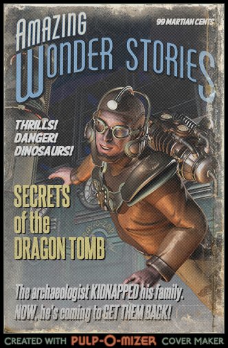
Thanks again to Pulp-O-mizer. (Yes, I could do this all day...)
(Secrets of the Dragon Tomb will be published by Christy Ottaviano Books (Henry Holt / Macmillan) ... in the future.)
Also check out the cover I did for Steph's middle grade fantasy novel, Renegade Magic (Kat, Incorrigible book 2) which is out now in hardcover and in mass market paperback on March 5, 2013.
This time for Secrets of the Dragon Tomb itself.
Thanks again to Pulp-O-mizer. (Yes, I could do this all day...)
(Secrets of the Dragon Tomb will be published by Christy Ottaviano Books (Henry Holt / Macmillan) ... in the future.)
Also check out the cover I did for Steph's middle grade fantasy novel, Renegade Magic (Kat, Incorrigible book 2) which is out now in hardcover and in mass market paperback on March 5, 2013.
Subscribe to:
Posts (Atom)