Wednesday, 18 April 2012

Announcement!

Today is the day for my very exciting (for me!) announcement:

I'm starting to offer ebook cover design services, alongside my existing web design services. I've blogged about designing covers before, and I've blogged some of my own covers, but now that I've caught up on my backlog of covers, I'm throwing open my design services to anyone who wants them!

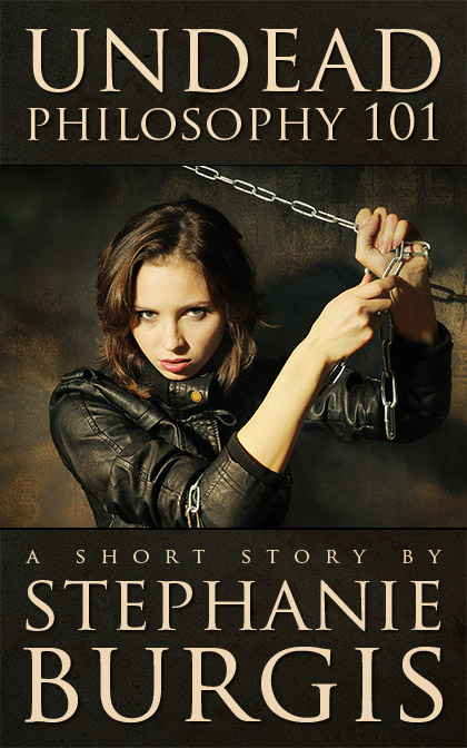
Incidentally, here are the last couple of covers I've completed, both for re-issues of previously-published short stories by Stephanie Burgis.


(Some Girlfriends Can is available on Amazon now, and Undead Philosophy 101 will be available tomorrow; both will turn up on Smashwords and other retailers fairly soon.)

You can see more cover examples and find the full details of my service on my ebook cover design website, but in short, I'm charging $200 for an ebook cover. This gives you an eye-catching, high-resolution, optimized jpeg cover, suitable for inclusion in any ebook. 

These covers are ideal for authors re-issuing their back-catalogs and for those who are publishing independently and are looking for a professional cover.

I'm also offering ebook conversion services, and print cover design to go with your ebook. Basically, if you want it, I can do it! :)

Monday, 2 April 2012

Ebook publication news!

This post is entirely self-promotion, so feel free to skip to the next one, which hopefully will be something useful...

I have finally uploaded some of my short stories to Amazon. These are all previously published short stories (with the exception of one original), and they appeared in magazines like Realms of Fantasy, Strange Horizons, Interzone, and Black Static. Most of them are fantasy or dark fantasy. A couple of them are YA fantasies.

I'm really proud of these stories, and if short fantasy stories are your thing, I hope you'll enjoy them too.

Let's get down to it. Here are the stories I've uploaded:

Bone Roads

This is actually a collection of nine short stories. Eight are reprints, and one is an original. Here's the blurb:

A ghost searches for revenge in ancient Egypt.
A girl risks awakening a dark god to save her dog.
A boy unearths the bones of a dragon…

The Stories:

- When the Dragon Falls
- A Field Guide to Ugly Places
- The Frog King
- Five Things of Beauty
- Dawn, by the Light of a Barrow Fire
- The Sea Beyond Thule (Original to this collection)
- The Land of Reeds
- The Western Front
- At the Gates

On amazon.com | on amazon.co.uk

Uncle Vernon's Lie

This short story was first published in Realms of Fantasy.

The blurb:

In Uncle Vernon’s garden, the river of stars might sweep you away. Satyrs weave tales on looms made of moonbeams. Worlds fall and die in every single teardrop. And Uncle Vernon tells stories that can’t possibly be true.

But Benji knows that his uncle will only tell him one lie in his whole life, and hidden among those stories full of secrets both frightening and wonderful is the single lie that might break Benji’s heart.

On amazon.com | on amazon.co.uk

Crab Apple

This short story was first published in Realms of Fantasy, and reprinted in Year's Best Fantasy.

The blurb:

"I saw her first the day I found Dad on the kitchen floor. The new girl. The wild girl..."

When Josh’s dad falls ill with lung cancer and a strange new girl appears at his school, Josh has to face up to two frightening threats. They may be more closely linked than he realizes.

It's a YA fantasy short story.

On amazon.com | on amazon.co.uk

Finisterre

This short story was first published in the much-missed The Third Alternative magazine.

The blurb:

For twenty five years, since the death of his lover, Thomas Carlyle has drifted from dead-end job to dead-end job. But when he meets a stranger on the subway, and the stranger tells him a secret, he can ignore his grief no longer.

Somewhere, no more than a pen stroke away, his past may be waiting … in Finisterre.

On amazon.com | on amazon.co.uk

Camelot

This short story was first published in Interzone.

The blurb:

Sam may only look 22, but he's spent the last 67 years searching for his brother, who was shot down over France during World War II. All he has to go on is a dream of his brother in a ruined castle, and the knowledge that his brother would never have abandoned him if their positions were reversed.

But now Sam is running out of places to look, and when he meets a strange woman, he starts to dream of things that never happened. His search is coming to its end, and somewhere, hidden, Camelot is waiting.

On amazon.com | on amazon.co.uk

At the Gates

This short story was first published in Black Static.

The blurb:

When Grace comes across a sick, stray dog in an alley, she thinks paying the vet’s bills and hiding the dog from her mother are going to be her biggest problems.

She’s wrong. Something is awakening. Something dark and old, and her problems are going to be much bigger, at the gates…

This is a YA dark fantasy story.

On amazon.com | on amazon.co.uk

A Veil, a Meal, and Dust

This short story was first published in Ideomancer.

The blurb:

The time has come for the Catechist of Yeratet to choose a new spouse. Parteeka Ren Sussu is determined that she will be the Catechist’s wife. All that stand between her and that exalted position are the other two remaining candidates.

Now all must tell their stories. Only one will be chosen. The others will die.

This is a science fiction story set in the far-future.

On amazon.com | on amazon.co.uk

You can also download the stories from various European Amazon stores. You can find the ebooks via these links:

On Amazon Germany

On Amazon France

On Amazon Italy

On Amazon Spain

Sorry, the stories are only available on Amazon right now, but I'll start converting them for Smashwords and the markets it supplies over the next few weeks.

Thursday, 29 March 2012

Ebook covers

Okay, so yesterday, when I wrote my blog entry "Seven Tips for Designing an Ebook Cover", I foolishly promised that today I would post the covers that I had done so far, so that you could all jeer and shout about how I shouldn't give advice if I couldn't design... Not that any of you are that mean, of course. But feel free to think it...

I was kind of hoping that I would also get the ebooks up on Amazon today, but I'm still finishing off the last one, then I have to figure out how to upload them to Amazon (I'm new to this!), so I expect it'll happen over the weekend.

Anyway! Enough blathering. Here are the covers I've done so far. The first one is for a collection of nine of my short stories. Eight have been previously published. One is an original.


The next six are all individual short stories. (All previously published). Here are the covers:


Three of these stories (At the Gates, Finisterre and Camelot) are a little similar in terms of style, and so I've tried to brand them using the same fonts and similar styles of art.

Most of the covers use the 'find good stock art and add text' school of cover design (highly recommended!)

One of them (Crab Apple) is my attempt to design a cover without using any stock art at all. I've only used photoshop brushes and shapes to make the illustration. I can't imagine I'll do that very often, as I'm definitely not an artist.

So, that's it. Feel free to shout at me in the silence of your minds. :)

Wednesday, 28 March 2012

Seven Tips for Designing an Ebook Cover

It's taken me a long time to get around to it, but I've finally decided to make all of my previously published short stories available as ebooks. Yeah, yeah, I know I'm way behind on this, but at least I'm getting around to it at last.

Because I'm a designer, I decided that I would design the covers myself. (And because I'm a web designer, and because ebooks are basically web pages, with a few peculiarities and limitations, I've also decided to do all the creating of the ebooks myself, but that's a topic for another day.)

So today I thought I'd share some observations and tips about designing an ebook cover.

Your cover is a not an illustration of a scene from your book

And it doesn't have to show the characters in your book accurately.

Your book cover has two jobs:
  1. To represent the type of book it is.
  2. To grab the attention of a potential reader.
If it also happens to show a scene or character from the book, that's nice, but it's hardly essential. If you are designing your own cover, you're almost certainly going to be using stock art or stock photography, and the chances of finding a great photo or piece of art that also exactly fits something in your story is minimal.

Your first priority should always be to find a picture that feels like your story and which has an immediate grab-factor. Don't be too literal when searching for your stock art.

Here's an example. This is one of the covers I'm working on (I promise I won't fill this blog entry with my covers as examples!):


There is certainly no cat in this story (sorry to cat lovers!). But the illustration does represent the kind of magic in this story, and there is a scene at night with the boy and his uncle looking at the stars. It's a representative cover, not a strictly accurate one.

Avoid generic photos

It's really easy to find beautiful pictures of scenery (woodland, or impressive buildings, or stuff like that), but these rarely work as covers. They just don't jump out when a potential reader is skimming past, and they don't say anything about your book. Look for something unique and simple that stands out.

I may be tiny, but I'm still cute

Thumbnails rule the world. If you're self-publishing an ebook, you are massively reliant on your cover being noticed on an online store. That means a thumbnail image on a search screen. You're talking about something maybe 100 by 160 pixels (or smaller, on something like the 'Customers who Bought This...' section). If your cover doesn't stand out or is difficult to figure out at that size, you won't be noticed.

Traditionally published books are far less reliant on online stores. They have bookstores where their full-sized covers can be admired.

Check your cover at a width of 100px. If it doesn't work there, think again.

Don't attempt to composit multiple photos into a single image

Unless you're a Photoshop professional (and by this I mean someone who uses Photoshop to make a living, every day; using Photoshop at home or occasionally at work doesn't count), then don't attempt to make an image using multiple source photos. It will look bad, and it will be obvious.

Compositing photos, particularly if you've first had to extract part of one image from a background, is really, really hard to do well enough. Even some commercial covers suffer from bad attempts at this.

Find a single piece of art or photo that works and use that.

You need space for text

This is a mistake I made on my first few covers.

Look at any commercially-designed book cover and you'll notice one particular thing: there is plenty of space for text: the author's name, the book title, maybe quotes and a tag. The image (or the high impact part of the image, anyway), only fills part of the cover. Space has been deliberately left for the text.

Look at this cover:


There's a large white space at the bottom for the text. Or, more extreme:


Even where text is placed across an image, it should be over the least "busy" part of the image, as with this example:


Now, traditionally-published books have a big advantage: they generally commission original art or photography, or, where they use stock imagery, they generally use it to make a more complex piece. Unless you're an artist or a photoshop master, you don't really have that option. You need to use stock art, and stock art is not generally composed with book covers in mind; there is rarely space for text.

You have three options:
  1. Keep looking until you find stock art that does leave space for text and fits.
  2. Make room for text. Generally by extending the canvas to create space at the top or bottom (or, sometimes, the sides) as I did on my ebook cover above.
  3. Put the text over the image.
This third option is almost certainly the hardest, and if the image is complex, you're going to be almost out of luck. Which brings me to:

How to do text...

There are two things that, more than anything else, make an amateur cover stand out from a professionally-designed one. The first one, as I mentioned, is a botched attempt at compositing images. The second is the way the text looks on the cover.

Text is tough to do. You wouldn't think it would be, but it is. It's probably the hardest part of any design you do. The text has to stand out and be readable, ideally even at thumbnail size, but it also needs to be an integral part of the design; it's part of the artwork itself.

The key is simplicity. If you're using photoshop, or a similar program, you will be given a whole host of ways of manipulating it. Resist!

The more effects that you add to the text, the less it will feel like it's part of the cover, and the more amateurish it will seem. 
  • Flee for your life from the temptation to use satin, bevel and emboss effects.
  • Be very cautious about using gradient or pattern overlays, inner glows and inner shadows.
The three effects you should familiarize yourself with are drop shadows, stroke, and outer glow. They can add life to your text without making it look like a horrible alien explosion on your cover.

But if you do use them, use them subtly. Don't go over the top. In most cases, someone giving your cover a casual glance shouldn't even notice they are there. They should be working in the background, almost invisible.

Someone Else's Fairytale uses drop shadows to help the text stand out
 from a complex image (as well as adding semi-transparent colors as
backgrounds to the text)

In many cases, though, you won't need them at all.

Black and White

It is very tempting, when you are starting out, to simply put white text on a black background (or vice versa) with no text effects. This rarely works for large text, unless you have a really excellent font. Try to avoid pure black and white together. Look for different colors, and some texture in the background, or work with outer glow to add dynamism.

Choose a good font

Most of the fonts that come packaged on your computer won't work well for book covers. Standard text fonts, like Times New Roman, aren't designed for this. There are plenty of places online where you can find good-quality, free fonts. (Try www.fontsquirrel.com, for example.)

Avoid fonts that are quirky, as well as handwriting or calligraphic fonts, unless you really know what you're doing. They are hard to work with. Look for something simple and elegant.

If all else fails, use Trajan Pro. It's clean, works beautifully at a large size, and it looks classy and professional.

Aerophilia uses Trajan Pro for its title
 (as does Someone Else's Fairytale, above).

Okay, those are my tips so far. As always, there are exceptions to every rule, and an experienced designer can ignore any or all at will.

Update: Actually, that was eight tips. I may have studied higher mathematics, but I still can't count...

If you're interested in my ebook design services, you can see my portfolio and rates on my ebook design website.

Thursday, 1 March 2012

Children's books

I am, unfortunately, one of those people who reads the comment sections on newspaper websites. I know I shouldn't. I know they contain the biggest selection of trolls, bigots, crazies and snobs gathered in any one place outside of YouTube.

But I can't help myself. There they are, those comments, right a the end of the articles, and I find myself scrolling onto them again and again and being horrified and outraged (something, no doubt, the newspapers rely on to improve their advertising revenue from page impressions and time-on-page).

This week, with the news that JK Rowling was going to publish an adult novel, the snobs in particular were out in force.

There's one particular meme amongst the snobs that keeps recurring. It goes something along the lines of 'Rowling is attempting to write a "proper" book. She might have gotten away with bad writing for children, but she won't manage for adults.'

Leaving aside the ridiculous suggestion that Rowling is a bad writer (she isn't; the fact that she violates certain pre-conceived writing rules merely shows that the 'rules' are too limited), I am going to offer this defence that C.S. Lewis made in response to criticism of The Hobbit:
It must be understood that this is a children's book only in the sense that the first of many readings can be undertaken in the nursery. Alice is read gravely by children and with laughter by grown-ups; The Hobbit, on the other hand, will be funniest to its youngest readers, and only years later, at its tenth or twelfth reading, will they begin to realise what deft scholarship and profound reflection have gone to make everything in it so ripe, so friendly, and in its own way so true.
As the parent of a three-year-old, I recognise this in so many children's books. They are for children, of course, but not just for children. Adults can find something quite brilliant in them too. It's not true of all children's books, of course, but it is of many of them, and many of the best. Rowling is a writer like that, just like Tolkien was.

And those who refuse to read and appreciate them because they are 'children's books' are being no more than snobs.

Friday, 24 February 2012

10 Things Every Author’s Website Should Include

1. Who You Are

Okay, this might seem obvious. But most people who arrive at your website won’t know much about who you are or what you do. Some of them will have followed a link, others will have come via a search engine. They might not even know you’re a writer. And they might arrive at any random page on your website.

Your name and what you write on the top of every page (www.stephanieburgis.com)

Make it very clear on the top of every page who you are and what you write. Your name and either a tagline or a (very) brief intro are ideal.

2. What You’re Selling

Most authors don’t like selling. We think we’re being pushy and that we’re going to come off as arrogant. But our visitors want to know what we’re selling. They want to know about our books or stories. They’re not going to appreciate having to dig into the depths of our websites to discover them.

Let your visitors see what you’ve written and let them see what it’s about. If they’re not interested, they’ll move on, and they won’t be offended.

Highlight what you're selling (www.liahabel.com)

If you’ve got another book coming out soon, make sure you promote that too.

Highlight your next book too (www.juliejames.com)

3. An Excerpt

Not everyone goes to bookstores anymore, and not every bookstore will carry your book. If you’ve followed step 2, you’ve already got your cover and a brief description on the front page of your website, and on a page specifically about your book. Now you need to give your potential reader the chance to decide if they are actually going to like it.

Almost every publisher is happy to let you post a portion of your novel on your website (and your contract probably explicitly lets you do this). Try to post the first three chapters, but certainly put up the first chapter. Make sure you check with your publisher first, though.

Let your visitors read excerpts (www.nkjemisin.com)

Make sure the chapters are real web pages, not just PDFs or ebooks to download. It’s okay to have downloadable versions too, but most readers will want to get a taste straight away, just as they would flick through a book in the store.

4. Calls-to-Action

Eventually, you are going to want your visitors to do something, other than just leave your website. It might be as simple as giving them the chance to leave a comment or tweet a link to the book. Or it might be to buy your book. To throw in a bit of jargon, you want to offer them a ‘call-to-action’.

A ‘call to action’ can just be a link, but it’s better if you can make it really prominent so that it pops out of the page.

Clear calls-to-action (products.sitepoint.com)

Every page on your website should have some kind of call-to-action, so that your visitors don’t hit a dead end at the end of the page, and every major section of a page would benefit from one too.

5. Your Next Book

Once someone has read your book and loved it, they may visit your website to find out when your next book is due, particularly if you are writing a series. Tell them! If you don’t know the exact date, or even if you don’t yet have a cover or title, make sure you let them know there’s another book coming and roughly when.

Readers want to know what you're publishing next (www.stephenking.com)

6. A Complete, Up-to-Date List of Your Books

Number six in any list is where the author shares a vague, personal anecdote (I just made that up), so here goes. Some years ago, I was a big fan of a certain author. I read every one of his books I could find. But then no new books appeared. I checked the bookstores and the libraries, but nothing.

I looked on his website. Zilch. I was disappointed, but not surprised; these books were quirky, and they certainly weren’t bestsellers. I figured the publisher had dropped the author.

Fast-forward a few years, and I’m looking through Amazon, and I suddenly think to check up this author. I find out that not only is there a new book by this author, but the author has been publishing steadily, through a small press. I checked his website again, but still no mention of these books.

In fact, you’d probably be surprised at how many author websites are like this. It’s crazy. I would have been buying this author’s books all these years if he had listed them on his website.

Now, websites can be time-consuming. That’s why you need to be realistic when you’re building or commissioning your website about how much time you can put into it. If you commit yourself to a blog, and a news section, and videos and a vast selection of extras and you don’t have time to do it, your website will quickly become out of date.

But! At the very least, you need a page that lists your works and which is always up-to-date. If you mention publication dates and books in several places, make sure you keep a list of the locations, so that you can update everything at once. And schedule a complete review of your site a couple of times a year where you read through every page and fix what needs fixing.

7. An ‘About Me’ page

Unless you have a very good reason for needing privacy, you should always have an ‘about me’ page on your website, with a photo. If readers love a book, they want to feel like they have a connection with the author. They want to know about the author.

About the author (www.writingandsnacks.com)

Remember, though, that you need to tailor your biography to your audience. If you’re writing funny books for eight-year-olds, don’t go on about your jobs and degrees. Author Barry Eisler has an excellent article on writing your biography.

8. Cross-Linking

If you’ve got a large website, particularly if you’ve got a blog, you should make sure you cross-link to your books or stories. For example, a visitor may well have arrived at your website to read a blog post.

Your blog posts will, of course, be enough to make them interested in you and your work. So make it easy for them. Feature books and stories on every page, and cross-link from each book or story to another one. Give your readers the chance to discover all your work.

Cross-linking so readers can easily find your books (www.tobiasbuckell.com)

9. Clear, Easy-to-Read Text

If there’s one thing that writers’ website fall down on more than anything else, it is the typesetting on the page. The chances are, your website is going to have quite a bit of text on it, particularly if you’re posting extracts from your novels. That text needs to be easy to read.

This means, in almost all cases, you should have a white (or nearly white) background with dark (not pure black) text. Dark backgrounds or backgrounds with significant amounts of texture make reading text much more difficult.

There should be a reasonable amount of space between lines (for web techies among you, that usually means a line-height of 1.5 - 1.6 em), and you should use a clear, simple font (nothing too elaborate).

If your website was built more than two or three years ago, the chances are that your text is too small. Back then, most people were still using fairly low-resolution screens that sat on their desks.

But screens are changing fast. They are becoming much higher resolution, and tablets (e.g., iPads) and smart phones are becoming far more common. This means that the text on many websites is now painfully small. Sadly, even some newer websites are still being built with tiny text. Make sure yours isn’t one of them. (Again for web techies, a font-size of at least 13 or 14px is the minimum you should be aiming for with most fonts.)

Clear, easy-to-read text is absolutely essential (www.jennreese.com)

10. Contact Info

At some point, people are going to need to contact you, maybe to chat, maybe for business, maybe just to tell you how great you are. Ideally, you should have a contact form on your website, rather than an email address.

Make it easy to contact you, your agent or your publisher (www.stephanieburgis.com)

If you do have a contact form, don’t include a ‘captcha’ (one of those annoying things where you have to figure out a horribly distorted word and type it in a box). Don’t make people jump through frustrating hoops just to contact you. If you have to deal with a bit of spam, that’s a price worth paying, and there are other ways to stop spammers. (Ask your web developer how...)

If for some reason you don’t want to allow visitors to contact you, make sure you include contact details for your agent or publisher.

And a Bonus...

If you want to keep your readers simmering nicely until your next book is out, think about an ‘extras’ or bonus material section on your website. Extra chapters, background material, additional short stories, ‘making of’, games, newsletters, competitions, seasonal specials, and whatever else you can think of. You might also consider making this a members section with exclusive content, to reward people who sign up to be contacted by you. Eloisa James does this as well as any author I’ve come across.

Extras keep your fans excited between books (www.eloisajames.com)

The End, at Last...

What do you look for when you visit an author's website? What particularly good (or bad!) sites have you visited recently?

I'd love to hear your thoughts and ideas on this!
Thursday, 16 February 2012

Recommendations?

A few weeks ago, I blogged about learning lessons from screenwriting for writing fiction. Then, a couple of days ago, someone pointed me to J.K. Rowling’s wonderful (if enigmatic) handwritten plot spreadsheets for The Order of the Phoenix.

I’ve been thinking for a while that I should start outlining my stories more. Maybe not short stories, but novels, certainly.

I’ve always told myself that I don’t work well with outlining, that my best stuff comes when I writing blind and in the moment. And to a degree that’s true. But I’m also more prone to hitting brick walls or having to backtrack, or just sitting there wondering where the hell the story should go next.

I think part of my reluctance is because I can get caught up in being a little too mechanistic, sometimes, in forcing my story in directions it shouldn’t go in order to fit a preconceived idea, and then having to do a lot of work to unpick it. I worry that outlining will make that worse.

But I don’t think it has to. Not if the outline has room for shift. And maybe if I do outline properly, I’ll solve those issues before I even come to them.

So, I’m going to try it, but I need your help! Or your recommendations at least. If you outline, do you have a particular method? What kind of things do you include or leave out? Can you recommend any particular books on outlining (screenwriting or novel writing, I don’t mind)?

I’d really appreciate any suggestions. Otherwise my whiteboard will remain empty for a very long time. ;)

Wednesday, 8 February 2012

Today's journal entry...

... is not happening today, due to various family illnesses (flu, tonsillitis, etc.; nothing majorly serious). Sorry.

Hopefully later in the week.

Thursday, 2 February 2012

Popular fiction

You know that thing that authors do from time-to-time? Where they take a short story they've written and expand it into a novel? And it never turns out to be a good idea? It just doesn't. Because the idea that can make a brilliant short story rarely can be stretched into a whole novel. Sometimes short stories (or novellas) are just the right length, and anything else is padding.

Take Flowers for Algernon, for instance, by Daniel Keyes. This is a quite brilliant short story. (If you haven't read it, you must.) The novel, however, isn't. It's not bad, by any means, but it comes nowhere near the brilliance and impact of the short story. Daniel Keyes might have been better advised to leave it as a short story and write something else for his novel.

Which brings me to this blog entry. Actually, this blog entry isn't about short stories or novels, nor the adapting of one into the other. In fact, it's about something else entirely.

But it is the blogging equivalent of turning a short story into a novel. I'm writing a blog entry that is based on a couple of tweets I twitted yesterday. The fact that I summed up my thoughts succinctly in a couple of tweets isn't going to stop me turning it into a blog entry.

A couple of days ago, a pompous fool desperate for publicity was quoted in the Guardian laying into the current poet laureate, Carol Ann Duffy. Now I don't really care whether he's right or wrong about her being a bad poet. I'm not qualified to judge as I rarely read poetry.

What really bugged me was the 'defense' in one of the comments, which basically said that we shouldn't worry too much about people reading Duffy because they would probably go on to read other stuff.

This is a really old, and really condescending, 'defense'. It's the 'literature as a gateway drug' argument. I see it used over and over again, for fantasy and science fiction, for romance, for children's books, for thrillers, in fact, for anything popular. Don't worry about them reading J.K. Rowling or Stephanie Meyer or Stephen King or any of a thousand other popular authors, because after that they might go on to read something 'better'.

Better, in this case, always seems to mean something more literary, about big, intellectual, philosophical issues. Something inaccessible and difficult.

The only value of popular fiction, the argument goes, is to hook readers onto the hard stuff.

Well, it doesn't work like that.

Popular fiction is worthwhile by and for itself. Fiction doesn't exist only to interrogate intellectual problems. There is nothing wrong at all--in fact there is enormous value--in writing for entertainment (and that much-derided word 'escapism'), rather than dry, intellectual stimulation. There's nothing wrong at all (and much to recommend) being accessible and easy to read. Being inaccessible is not a merit in and of itself.

Storytelling has always included a high degree of entertainment, right from the very earliest recorded stories. The lessons in those stories, the models for living lives, were delivered through the medium of entertainment, and that is what popular fiction does. And even if it only entertains, there's nothing at all wrong with that.

So, please, don't defend popular fiction as a gateway drug. Don't say 'at least they're reading something, and they'll eventually go on to read something better', because it's not true. Popular fiction is worth reading. It's not there to lead you to something else. It's there for itself, whether the pompous fools like it or not.

Wednesday, 25 January 2012

Writing and screenwriting

I started to write a blog entry the other day, saying some critical things about a couple of TV shows. In particular, I was criticizing how the shows didn't seem to be able to make up their minds about what kind of shows they were. They would go in one direction for a while (dark, adult, for example) then suddenly switch course (comedy, for example). I was saying the writers didn't have enough belief in their shows.

But you know what? That's not this blog entry. I trashed that one. I trashed it because of a DVD extra that I watched from Angel, season 3. The extra is called 'From Page to Screen', and it covered pretty much what you would expect: the whole process of coming up with an episode of a show from conception to finished product.

The writers on the show have (if they are lucky) a week to write a 42 minute episode of a show. A week. Sometimes less. And this is the way they have to go about it:

  1. Someone pitches an idea and it gets structured it, point by point, in a writers' meeting
  2. One of the writers takes that away and writes an outline
  3. They return the outline and are given notes on it
  4. Take the notes away and write the script
  5. Get notes on the script and rewrite it
A week to write it. Sometimes for or five days. For 22 episodes in a year.

I realized that I, as a short story and novel writer, am in absolutely no position to criticize a few inconsistencies in a show when that's the process they have to go through so quickly just to get a script.

And I can't help but think that many of us who do write short stories and novels can be just a little bit too precious about our writing. 

I have writing sessions where I come away only having written 50 words. Sometimes nothing at all. If I was a screenwriter, that just simply wouldn't be an option. People would be waiting for the script, and they would have deadlines too. Short ones. 

If I was a screenwriter, I wouldn't be able to complain that I wasn't inspired or that I had no decent ideas that day or that I or that I was too tired or that I couldn't work from an outline. I wouldn't be able to wait two months between drafts to clear my head. I'd just have to do it. Right then. No matter what.

I wouldn't have the luxury of whining about an editor wanting to change that one little line that I loved. Everything I wrote would be torn up, mercilessly, if necessary, to make the episode work.

Now, I'm not saying that what is produced by a screenwriter working like this is necessarily better than that which a novelist working for a year or five years on a single book produces. (Nor vice versa, for that matter.) I'm not even saying that the forms are the same (fiction writing is a much more solo activity; screenwriting is more collaborative).

But I do think there's a lot we can learn from this type of process. About stripping away the chance for excuses. About not being overly precious and resistant to suggestions for changes. About planning and outlining and redrafting. About being accountable and about other people relying on you deliver something of quality on time, no matter what. About buckling down even if you're exhausted or uninspired or stressed. And that's what this blog entry always should have been about.