My latest cover is for a short story called Dueling Magics, by Stephanie Burgis, and here it is:

Dueling Magics is a short story set in the time between two of Steph's novels, Kat, Incorrigible and Renegade Magic (published in the U.K. as A Most Improper Magick and A Tangle of Magicks).
The Kat, Incorrigible books are middle-grade magical adventures in Regency Britain, with lots of humour and romance (for the older characters). Kat is a fantastically sparky, headstrong heroine for the series, and it was important to show that in the cover.
Very luckily (for me), back when Steph's first book was being prepared for publication, the publisher commissioned a beautiful cover by artist Barnaby Ward, but they eventually decided to go with a different style with the cover. This was the original cover:
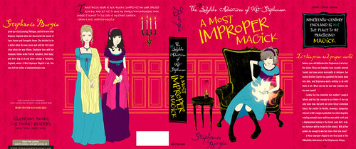
Barnaby Ward was kind enough to allow Steph to re-use this artwork for her short story.
Now, we could simply have chosen to take the front cover of this and change the title, leaving us with a fantastic cover.
But, the cover was designed primarily for a print book that would be in bookstores, where it could be picked up and examined at full size, with all the texture and weight of a print book. Dueling Magics is an ebook, and with ebooks, the thumbnail is absolute king. I wanted the cover to have more impact at thumbnail size.
The solution was pretty simple: zoom in on Kat. After all, Kat is the absolute centre of the story. The artist has captured her perfectly.
So, that was what I did. I cropped the image right in close. (I also changed the background, although now you don't see so much of it.)
Now that image really pops:

Okay, but it's not done. We need the text.
Ideally, with a cover, you want a fairly blank space to add the title and author. We don't have any completely blank spaces that are large enough here, but that's okay. The focus points of the image are Kat's face and her magic mirror. We need to leave these clear, but otherwise, we've essentially got blank space.
We also need to consider where we want to draw the eye on the cover. Well, the most important bits are going to be (probably in this order): the title, Kat's face, the author's name, the series title, and the magic mirror.
I've designed the text to make this emphasis work.
Now, I've talked before about the need for subtlety in the effects you add to the text on covers. In general, you don't want to go for enormous drop-shadows, outlines, colour gradients, outer glows and so on. Except when you do.
In this case, we're dealing with a middle-grade story. That's for readers who are anywhere between about 9 years old to 12 years old (or a year or two on either side). Subtlety is a lot less important in that group. In fact, it can actually be a disadvantage.
Things need more impact for this age range. Strong colours and big effects are what appeal to them.
But... it should probably go without saying that you need to do these well, or it'll be a disaster.
Here's how I chose to actually use the text in the final image:
As you can see, I've chosen a pretty heavy effect on both the book title and the series title, to make them stand out against their backgrounds and (for the story title) to pop out of the page.
Take a look at some commercial middle grade covers (particularly in the younger middle-grade range) and you'll see the designers following the same principles.
By the way, if you want a copy of Dueling Magics, right now it's free as an ebook in all formats on Smashwords (for now, at least). If you prefer to use Amazon to get your ebooks, the story is available on Amazon.com and Amazon.co.uk (as well as the other Amazon international stores), although it isn't free there (but it is the cheapest possible price; Amazon doesn't usually allow authors to make their stories free on Amazon).
Enjoy the cover, but much more importantly, enjoy the story!
4 comments:
Hey Patrick, beautiful cover! Amazon will make the story free if it goes free in iBookstore and Barnes and Noble via Smashwords, and while this can be a little complicated, it seems like a pretty reliable mechanism. I'm about to try it with my Coyote story.
That's good to know, Emily. We'll wait for it to filter through, then I'll re-publicise it!
Brilliant work! Nice to see some of the thought that goes into these designs. And of course, I've already grabbed a copy!
Thanks, Eugene!
Post a Comment