Occasionally, when I put together a new ebook cover for a client, I like to give a little bit of insight as to how it came about what I did to make it, for those of you designing your own covers.
My latest cover is for a short story called Dueling Magics, by Stephanie Burgis, and here it is:
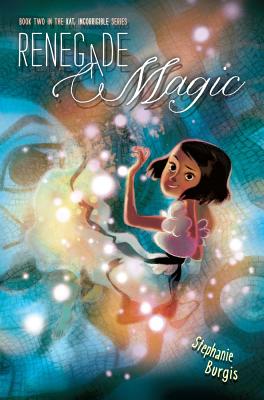
Dueling Magics is a short story set in the time between two of Steph's novels, Kat, Incorrigible and Renegade Magic (published in the U.K. as A Most Improper Magick and A Tangle of Magicks).
The Kat, Incorrigible books are middle-grade magical adventures in Regency Britain, with lots of humour and romance (for the older characters). Kat is a fantastically sparky, headstrong heroine for the series, and it was important to show that in the cover.
Very luckily (for me), back when Steph's first book was being prepared for publication, the publisher commissioned a beautiful cover by artist Barnaby Ward, but they eventually decided to go with a different style with the cover. This was the original cover:
Barnaby Ward was kind enough to allow Steph to re-use this artwork for her short story.
Now, we could simply have chosen to take the front cover of this and change the title, leaving us with a fantastic cover.
But, the cover was designed primarily for a print book that would be in bookstores, where it could be picked up and examined at full size, with all the texture and weight of a print book. Dueling Magics is an ebook, and with ebooks, the thumbnail is absolute king. I wanted the cover to have more impact at thumbnail size.
The solution was pretty simple: zoom in on Kat. After all, Kat is the absolute centre of the story. The artist has captured her perfectly.
So, that was what I did. I cropped the image right in close. (I also changed the background, although now you don't see so much of it.)
Now that image really pops:
Okay, but it's not done. We need the text.
Ideally, with a cover, you want a fairly blank space to add the title and author. We don't have any completely blank spaces that are large enough here, but that's okay. The focus points of the image are Kat's face and her magic mirror. We need to leave these clear, but otherwise, we've essentially got blank space.
We also need to consider where we want to draw the eye on the cover. Well, the most important bits are going to be (probably in this order): the title, Kat's face, the author's name, the series title, and the magic mirror.
I've designed the text to make this emphasis work.
Now, I've talked before about the need for subtlety in the effects you add to the text on covers. In general, you don't want to go for enormous drop-shadows, outlines, colour gradients, outer glows and so on. Except when you do.
In this case, we're dealing with a middle-grade story. That's for readers who are anywhere between about 9 years old to 12 years old (or a year or two on either side). Subtlety is a lot less important in that group. In fact, it can actually be a disadvantage.
Things need more impact for this age range. Strong colours and big effects are what appeal to them.
But... it should probably go without saying that you need to do these well, or it'll be a disaster.
Here's how I chose to actually use the text in the final image:
As you can see, I've chosen a pretty heavy effect on both the book title and the series title, to make them stand out against their backgrounds and (for the story title) to pop out of the page.
Take a look at some commercial middle grade covers (particularly in the younger middle-grade range) and you'll see the designers following the same principles.
By the way, if you want a copy of Dueling Magics, right now it's free as an ebook in all formats on Smashwords (for now, at least). If you prefer to use Amazon to get your ebooks, the story is available on Amazon.com and Amazon.co.uk (as well as the other Amazon international stores), although it isn't free there (but it is the cheapest possible price; Amazon doesn't usually allow authors to make their stories free on Amazon).
Enjoy the cover, but much more importantly, enjoy the story!
Showing posts with label cover design. Show all posts
Thursday, 28 February 2013
Cover Case Study: Dueling Magics, by Stephanie Burgis
Labels:
book covers,
cover design,
ebook design,
ebooks
Thursday, 2 August 2012
New Ebook Design: The Tyranny of Heroes, by Terry England
My latest ebook cover is for Terry England's novel The Tyranny of Heroes, which is now up on Amazon and Barnes and Noble. I'll talk about how I designed the cover, but before I do, here is the final cover:
Here's where you can buy the ebook:
Amazon.com | Amazon.co.uk | Barnes and Noble
Terry had already worked on a cover concept with an artist friend, and he sent it through to me for inspiration. (There's certainly no need to do this with your cover designer!) But he was very clear that I should produce the best cover I could, whether I used the concept for inspiration or not. Here was the sketch he sent me (sorry, I don't know the artist's name):
The sketch shows a statue of one of the superheroes in the book. Terry particularly wanted the anger of the hero to show through (it doesn't really in this sketch).
The first thing for me to do was to find a piece of stock art to work with. I almost always start with a piece of stock art and then embellish and alter it. This isn't unusual; even the big six publishers often use stock art, and commissioning original art is usually out of the budget of independent publishers.
This was the piece I ended up buying. The pose works, and I think there is clear anger in the hero's eyes:
The first problem with this image is that it's far too clean for what I want. It gets nothing of the dark undertones of the tyranny of the superheroes. The first thing I did was to add some texture to it.
I found an image of an old sheet of paper from wegraphics.net. Then, in Photoshop, I placed it over the top of the superhero image. I desaturated the paper using a Hue/Saturation adjustment layer clipped to the paper with saturation set at -100. (Techie details alert...) I changed the blending mode to Hard Light to emphasise the texture and reduced the opacity of the layer to 84%. This is what I get:
We're getting somewhere with the texture now, but I don't like the texture on top of the superhero. He doesn't "pop" enough to stand out. I duplicated the original image, extracted the superhero, and placed that extracted superhero in a layer above the paper layer.
That's better, but it's still not quite there. We still haven't got that full impression of the effect of the superheroes. We decided to try to add some ruined buildings behind the superhero. Now, we have to be careful here. Ebook covers have to work really well at thumbnail size, and if we add too much to the image, we'll confuse it and make it messy at small size.
I went looking at flickr, and I managed to find this image of Toronto Fire ruins. It's released under a Creative Commons 2.0 license, which means that I can use it as long as I give attribution (which I have done in the ebook).
It was really important in choosing an image of ruins to find one that fitted the shape of the superhero, both to ensure that the image was well-balanced and retained its focus, but also so it didn't distract at thumbnail size.
I removed the text at the bottom of the photo, then placed it beneath the original image layer. I reduced the opacity of the ruins to 95% and changed the blend mode of the original image to Multiply. This is now what I have:
This is my cover image. I've left the bottom of the picture relatively clear, because I'm going to use it for the text.
And so onto the text. I have quite a lot of text to include and I don't have a particularly clear space to put it in. I needed a compact, strong display font. I chose a font called Bebas. I wanted the word "Tyranny" to really stand out. At the smallest thumbnail, you're just not going to be able to read everything on the cover, so having "Tyranny" and the picture prominent gives a really clear idea of the book.
Which brings us back to the final cover:
I've used a gradient overlay, drop shadows, and a black stroke on the text to make it stand out, and I've given the author's name a very faint white outer glow, to help it stand out against the black ruins behind it.
And that's how you can go about designing a cover.
Let me know if you have any questions about the process.
(I should add that I also formatted the ebook, which was a fairly complex process, but I'm still intending to talk about ebook formatting in a future blog entry, so I'll won't talk about that here.)
Here's where you can buy the ebook:
Amazon.com | Amazon.co.uk | Barnes and Noble
Terry had already worked on a cover concept with an artist friend, and he sent it through to me for inspiration. (There's certainly no need to do this with your cover designer!) But he was very clear that I should produce the best cover I could, whether I used the concept for inspiration or not. Here was the sketch he sent me (sorry, I don't know the artist's name):
The sketch shows a statue of one of the superheroes in the book. Terry particularly wanted the anger of the hero to show through (it doesn't really in this sketch).
The first thing for me to do was to find a piece of stock art to work with. I almost always start with a piece of stock art and then embellish and alter it. This isn't unusual; even the big six publishers often use stock art, and commissioning original art is usually out of the budget of independent publishers.
This was the piece I ended up buying. The pose works, and I think there is clear anger in the hero's eyes:
The first problem with this image is that it's far too clean for what I want. It gets nothing of the dark undertones of the tyranny of the superheroes. The first thing I did was to add some texture to it.
I found an image of an old sheet of paper from wegraphics.net. Then, in Photoshop, I placed it over the top of the superhero image. I desaturated the paper using a Hue/Saturation adjustment layer clipped to the paper with saturation set at -100. (Techie details alert...) I changed the blending mode to Hard Light to emphasise the texture and reduced the opacity of the layer to 84%. This is what I get:
We're getting somewhere with the texture now, but I don't like the texture on top of the superhero. He doesn't "pop" enough to stand out. I duplicated the original image, extracted the superhero, and placed that extracted superhero in a layer above the paper layer.
That's better, but it's still not quite there. We still haven't got that full impression of the effect of the superheroes. We decided to try to add some ruined buildings behind the superhero. Now, we have to be careful here. Ebook covers have to work really well at thumbnail size, and if we add too much to the image, we'll confuse it and make it messy at small size.
I went looking at flickr, and I managed to find this image of Toronto Fire ruins. It's released under a Creative Commons 2.0 license, which means that I can use it as long as I give attribution (which I have done in the ebook).
It was really important in choosing an image of ruins to find one that fitted the shape of the superhero, both to ensure that the image was well-balanced and retained its focus, but also so it didn't distract at thumbnail size.
I removed the text at the bottom of the photo, then placed it beneath the original image layer. I reduced the opacity of the ruins to 95% and changed the blend mode of the original image to Multiply. This is now what I have:
This is my cover image. I've left the bottom of the picture relatively clear, because I'm going to use it for the text.
And so onto the text. I have quite a lot of text to include and I don't have a particularly clear space to put it in. I needed a compact, strong display font. I chose a font called Bebas. I wanted the word "Tyranny" to really stand out. At the smallest thumbnail, you're just not going to be able to read everything on the cover, so having "Tyranny" and the picture prominent gives a really clear idea of the book.
Which brings us back to the final cover:
I've used a gradient overlay, drop shadows, and a black stroke on the text to make it stand out, and I've given the author's name a very faint white outer glow, to help it stand out against the black ruins behind it.
And that's how you can go about designing a cover.
Let me know if you have any questions about the process.
(I should add that I also formatted the ebook, which was a fairly complex process, but I'm still intending to talk about ebook formatting in a future blog entry, so I'll won't talk about that here.)
Wednesday, 4 July 2012
That's not how I imagined it! A quick look at a book cover
One of the most important things to remember, as an author, about the cover of your book is that it isn't a picture of a scene or of the characters in your book.
In a previous blog post, I argued that,
Here's the cover:
And here's blurb from the cover flap about the book:
The cover is clearly meant to show Abby standing in front of her new school. It captures the wonder and magic of the world perfectly, and it reaches out exactly to its target audience.
However, let's look at the description of the school from the book:
And so on.
In the book, the school is clearly in the middle of a large city, surrounded by other buildings. It is fenced and barred (for safety), with a courtyard.
On the cover, it's in the middle of the countryside, or at least in extensive grounds, with no other buildings around. There are no fences or bars.
In other words, the cover does not show a picture of a location or scene in the book. It's not "accurate", and it would be very tempting for the author to protest and ask for it to be changed. It would also be wrong.
It's very easy, as a writer, to react to a cover by thinking, That's not how I imagined it! That's not what my character looks like! But it really doesn't matter.
What matters is that the cover feels right for the book. That it stands out on the shelf. That it catches the attention of exactly the right audience, and it tells them what kind of book they're going to get. If it does, and if they are the right reader, there's a good chance they'll pick it up and try it.
That's the point of a good cover.
Buy Ordinary Magic: Indiebound | Barnes and Noble | Amazon.com
Credits: The cover illustration for Ordinary Magic is by Zdenko Basic and Manuel Sumberac. The cover design is by Donna Mark.
In a previous blog post, I argued that,
Your book cover has two jobs:A few weeks ago, I came across a cover that perfectly illustrated this principle. The cover is for Caitlen Rubino-Bradway's wonderful middle-grade novel, Ordinary Magic.
- To represent the type of book it is.
- To grab the attention of a potential reader.
Here's the cover:
And here's blurb from the cover flap about the book:
In a world where having magical abilities is considered normal, Abigail Hale's life is about to become a lot more interesting. That's because Abby has just been judged an "ord" —someone without any magic. None. Zero. Zilch!
Fortunately, Abby enrolls in a school that prepares young ords for getting along in the world despite their unmagical disability. [...]
The cover is clearly meant to show Abby standing in front of her new school. It captures the wonder and magic of the world perfectly, and it reaches out exactly to its target audience.
However, let's look at the description of the school from the book:
Dad parked the carpet right in front of a large building on an unusually empty street. [...] Carved into the paving stones was ward upon spell upon curse. [...] The school was square, and built out of dark-brown bricks. It was smaller then the buildings around it, only four stories tall, with a glass structure on top that gleamed so brightly under the sun it hurt to look. There was a fence all the way around the building, with bars on the first-floor windows and thick, strong shutters on the upper windows. The main entrance was barred by a sturdy gate that stretched above our heads, then arched into a short tunnel, revealing a courtyard beyond.
And so on.
In the book, the school is clearly in the middle of a large city, surrounded by other buildings. It is fenced and barred (for safety), with a courtyard.
On the cover, it's in the middle of the countryside, or at least in extensive grounds, with no other buildings around. There are no fences or bars.
In other words, the cover does not show a picture of a location or scene in the book. It's not "accurate", and it would be very tempting for the author to protest and ask for it to be changed. It would also be wrong.
It's very easy, as a writer, to react to a cover by thinking, That's not how I imagined it! That's not what my character looks like! But it really doesn't matter.
What matters is that the cover feels right for the book. That it stands out on the shelf. That it catches the attention of exactly the right audience, and it tells them what kind of book they're going to get. If it does, and if they are the right reader, there's a good chance they'll pick it up and try it.
That's the point of a good cover.
Buy Ordinary Magic: Indiebound | Barnes and Noble | Amazon.com
Credits: The cover illustration for Ordinary Magic is by Zdenko Basic and Manuel Sumberac. The cover design is by Donna Mark.
Thursday, 14 June 2012
New cover, plus free story
Okay, my latest cover is for a short story by YA author Karen Mahoney. The story is a prequel to her brilliant novel The Iron Witch and stars Xan, one of the main characters from The Iron Witch, but the story does stand alone if you haven't read the books yet.
Here's the cover:
Best of all, this short story, The Lost Boy, is absolutely free if you sign up to Karen's (also free) newsletter via her website. If you like YA urban fantasy, definitely check this out.
Here's the cover:
Best of all, this short story, The Lost Boy, is absolutely free if you sign up to Karen's (also free) newsletter via her website. If you like YA urban fantasy, definitely check this out.
Wednesday, 16 May 2012
Two New Covers
This week I've completed a couple of new covers for ebooks, so I thought I'd blog a little bit about the idea and process behind these covers.
If you read modern science fiction at all, you can't have missed the impact that Franco-Vietnamese writer Aliette de Bodard has made in the last couple of years. Not only has she been nominated for the Hugo, Nebula and Campbell awards, and won the British Science Fiction Association award, she has also had published three 'Aztec Mystery-Fantasies' novels to much acclaim.
This ebook consists of two recent short stories by Aliette: Scattered Along the River of Heaven, and Exodus Tides.
A book cover needs to give a potential reader the immediate impression of the kind of book it is, and what a reader can expect when they open it. It doesn't, however, need to illustrate a particular scene or character from the book.
The two short stories in this collection are both science fiction, the first a far-future space opera, the second a set in near-future France. Both address the theme of immigration. Aliette's writing also is more literary than pulp (although it's certainly not slow or dull!)
The initial concept was to combine a clear space opera image with a group of Asian characters walking into the fading, unknown distance, to illustrate a diaspora scattering to the strange, distant worlds.
However, it is enormously important that an ebook cover in particular works at a thumbnail size. That means it certainly needs to be clear at a height of 115 pixels (the standard height of an image on the Amazon search results screen). Illustrating that group of people walking away in the small amount of the cover that is given over to that part of the illustration would mean it would be impossible to make out what was going on at thumbnail size.
So, I made the group of figures standing closer together, as though in a group.
The photos of the figures all come from Flickr, incidentally; it's an excellent source of photography that you can use in covers. You need to choose photographs released under a Creative Commons Attribution license (and, of course, you need to provide the credits for the photos in your ebook).
The textures that I've used in the grey section of the cover are designed to give that impression of uncertainty and unfamiliarity that people emigrating (not always willingly) can experience.
Scattered Among Strange Worlds is due to be published as an ebook at the end of July. Look out for it. The stories are excellent!
By contrast, Stephanie Hale's Revenge of the Homecoming Queen is a sharp, funny YA novel with elements of mystery and romance . Here's the Goodreads description:
Stephanie came to me with a really strong concept for the cover. She wanted this particular photo of a young woman, but she wanted a chain necklace with the word "Revenge" on it added to the photo, as part of the book title. She also wanted a fun, 'girly' font to contrast with the more serious, high-impact photo.
I'm really pleased with the way the necklace (and the whole cover) came out. The hardest part of drawing something like the necklace onto this particular photo is that, if you look closely at it, you'll see that the photo is strongly focused on the lips and face. The neck is actually slightly out of focus, so to realistically add another element to this part of the photo, the other element actually has to be de-focused too.
That means slightly blurring the chain, and increasing the blur on it as it curves around the back of the neck.
For realism, the word "Revenge" should have been blurred too, but it also needs to be readable at various sizes, so I chose to only add a small amount of blur to the word on the chain.
Revenge of the Homecoming Queen is available now as an ebook from Amazon.com and Amazon.co.uk.
If you're designing your own ebook cover, here are a couple of random tips from these two covers.
P.S., if you want to see more of my ebook covers or if you're interested in hiring me for your covers, you should check out my ebook design website.
Scattered Among Strange Worlds - by Aliette de Bodard.
If you read modern science fiction at all, you can't have missed the impact that Franco-Vietnamese writer Aliette de Bodard has made in the last couple of years. Not only has she been nominated for the Hugo, Nebula and Campbell awards, and won the British Science Fiction Association award, she has also had published three 'Aztec Mystery-Fantasies' novels to much acclaim.
This ebook consists of two recent short stories by Aliette: Scattered Along the River of Heaven, and Exodus Tides.
A book cover needs to give a potential reader the immediate impression of the kind of book it is, and what a reader can expect when they open it. It doesn't, however, need to illustrate a particular scene or character from the book.
The two short stories in this collection are both science fiction, the first a far-future space opera, the second a set in near-future France. Both address the theme of immigration. Aliette's writing also is more literary than pulp (although it's certainly not slow or dull!)
The initial concept was to combine a clear space opera image with a group of Asian characters walking into the fading, unknown distance, to illustrate a diaspora scattering to the strange, distant worlds.
However, it is enormously important that an ebook cover in particular works at a thumbnail size. That means it certainly needs to be clear at a height of 115 pixels (the standard height of an image on the Amazon search results screen). Illustrating that group of people walking away in the small amount of the cover that is given over to that part of the illustration would mean it would be impossible to make out what was going on at thumbnail size.
So, I made the group of figures standing closer together, as though in a group.
The photos of the figures all come from Flickr, incidentally; it's an excellent source of photography that you can use in covers. You need to choose photographs released under a Creative Commons Attribution license (and, of course, you need to provide the credits for the photos in your ebook).
The textures that I've used in the grey section of the cover are designed to give that impression of uncertainty and unfamiliarity that people emigrating (not always willingly) can experience.
Scattered Among Strange Worlds is due to be published as an ebook at the end of July. Look out for it. The stories are excellent!
Revenge of the Homecoming Queen - by Stephanie Hale
By contrast, Stephanie Hale's Revenge of the Homecoming Queen is a sharp, funny YA novel with elements of mystery and romance . Here's the Goodreads description:
All that matters is what's inside...as long as there's a tiara on the outside.Revenge of the Homecoming Queen was first published in 2007, but it has never had an ebook edition until now.
The flawless Aspen Brooks was born to be Homecoming Queen. Naturally she's dating the most popular guy in school, and she's blessed with stunning good looks, excellent style, and mega brains. She's got the crown in the bag.
So why is the tiara being placed on the skanky head of cheerleader Angel Ives? The confusion only grows after ultra-dork Rand Bachrach is crowned king. To Aspen's shock and horror, Angel actually accuses her of being behind this. Whatevs!
But then something goes terribly, terribly wrong. Strange things start happening--even stranger than Angel beating Aspen. Now someone's leaving her threatening messages and slashing her tires. She's sure it's that beyotch Angel doing these things. And if Angel wants war, by Dooney & Bourke she'll get one.
Stephanie came to me with a really strong concept for the cover. She wanted this particular photo of a young woman, but she wanted a chain necklace with the word "Revenge" on it added to the photo, as part of the book title. She also wanted a fun, 'girly' font to contrast with the more serious, high-impact photo.
I'm really pleased with the way the necklace (and the whole cover) came out. The hardest part of drawing something like the necklace onto this particular photo is that, if you look closely at it, you'll see that the photo is strongly focused on the lips and face. The neck is actually slightly out of focus, so to realistically add another element to this part of the photo, the other element actually has to be de-focused too.
That means slightly blurring the chain, and increasing the blur on it as it curves around the back of the neck.
For realism, the word "Revenge" should have been blurred too, but it also needs to be readable at various sizes, so I chose to only add a small amount of blur to the word on the chain.
Revenge of the Homecoming Queen is available now as an ebook from Amazon.com and Amazon.co.uk.
A Couple of Tips
If you're designing your own ebook cover, here are a couple of random tips from these two covers.
- If you are adding a cut-out photo of a person to an image, try to avoid including the feet. It sounds weird, but the absolute hardest part of the figure to make realistic is where the feet meet the ground. Unless you are very, very good, your person will look like they are floating in the air. You can avoid this problem altogether by just not showing the feet. Note how on the first of these covers, the feet and lower legs of all four figures are hidden.
- Take a very careful look at the direction the light is falling on a photo. In the second of these covers, the light is coming from above (and a bit in front) the model being photographed. That means that every single other element added to the photo must have the light (and the shadows) fall in the same direction. If you don't do that, it will never look right.
P.S., if you want to see more of my ebook covers or if you're interested in hiring me for your covers, you should check out my ebook design website.
Wednesday, 18 April 2012
Announcement!
Today is the day for my very exciting (for me!) announcement:
I'm starting to offer ebook cover design services, alongside my existing web design services. I've blogged about designing covers before, and I've blogged some of my own covers, but now that I've caught up on my backlog of covers, I'm throwing open my design services to anyone who wants them!
Incidentally, here are the last couple of covers I've completed, both for re-issues of previously-published short stories by Stephanie Burgis.
I'm starting to offer ebook cover design services, alongside my existing web design services. I've blogged about designing covers before, and I've blogged some of my own covers, but now that I've caught up on my backlog of covers, I'm throwing open my design services to anyone who wants them!
Incidentally, here are the last couple of covers I've completed, both for re-issues of previously-published short stories by Stephanie Burgis.
(Some Girlfriends Can is available on Amazon now, and Undead Philosophy 101 will be available tomorrow; both will turn up on Smashwords and other retailers fairly soon.)
You can see more cover examples and find the full details of my service on my ebook cover design website, but in short, I'm charging $200 for an ebook cover. This gives you an eye-catching, high-resolution, optimized jpeg cover, suitable for inclusion in any ebook.
These covers are ideal for authors re-issuing their back-catalogs and for those who are publishing independently and are looking for a professional cover.
I'm also offering ebook conversion services, and print cover design to go with your ebook. Basically, if you want it, I can do it! :)
Thursday, 29 March 2012
Ebook covers
Okay, so yesterday, when I wrote my blog entry "Seven Tips for Designing an Ebook Cover", I foolishly promised that today I would post the covers that I had done so far, so that you could all jeer and shout about how I shouldn't give advice if I couldn't design... Not that any of you are that mean, of course. But feel free to think it...
I was kind of hoping that I would also get the ebooks up on Amazon today, but I'm still finishing off the last one, then I have to figure out how to upload them to Amazon (I'm new to this!), so I expect it'll happen over the weekend.
Anyway! Enough blathering. Here are the covers I've done so far. The first one is for a collection of nine of my short stories. Eight have been previously published. One is an original.
The next six are all individual short stories. (All previously published). Here are the covers:
Three of these stories (At the Gates, Finisterre and Camelot) are a little similar in terms of style, and so I've tried to brand them using the same fonts and similar styles of art.
Most of the covers use the 'find good stock art and add text' school of cover design (highly recommended!)
One of them (Crab Apple) is my attempt to design a cover without using any stock art at all. I've only used photoshop brushes and shapes to make the illustration. I can't imagine I'll do that very often, as I'm definitely not an artist.
So, that's it. Feel free to shout at me in the silence of your minds. :)
I was kind of hoping that I would also get the ebooks up on Amazon today, but I'm still finishing off the last one, then I have to figure out how to upload them to Amazon (I'm new to this!), so I expect it'll happen over the weekend.
Anyway! Enough blathering. Here are the covers I've done so far. The first one is for a collection of nine of my short stories. Eight have been previously published. One is an original.
The next six are all individual short stories. (All previously published). Here are the covers:
Three of these stories (At the Gates, Finisterre and Camelot) are a little similar in terms of style, and so I've tried to brand them using the same fonts and similar styles of art.
Most of the covers use the 'find good stock art and add text' school of cover design (highly recommended!)
One of them (Crab Apple) is my attempt to design a cover without using any stock art at all. I've only used photoshop brushes and shapes to make the illustration. I can't imagine I'll do that very often, as I'm definitely not an artist.
So, that's it. Feel free to shout at me in the silence of your minds. :)
Wednesday, 28 March 2012
Seven Tips for Designing an Ebook Cover
It's taken me a long time to get around to it, but I've finally decided to make all of my previously published short stories available as ebooks. Yeah, yeah, I know I'm way behind on this, but at least I'm getting around to it at last.
Because I'm a designer, I decided that I would design the covers myself. (And because I'm a web designer, and because ebooks are basically web pages, with a few peculiarities and limitations, I've also decided to do all the creating of the ebooks myself, but that's a topic for another day.)
So today I thought I'd share some observations and tips about designing an ebook cover.
Your book cover has two jobs:
Your first priority should always be to find a picture that feels like your story and which has an immediate grab-factor. Don't be too literal when searching for your stock art.
Here's an example. This is one of the covers I'm working on (I promise I won't fill this blog entry with my covers as examples!):
There is certainly no cat in this story (sorry to cat lovers!). But the illustration does represent the kind of magic in this story, and there is a scene at night with the boy and his uncle looking at the stars. It's a representative cover, not a strictly accurate one.
Traditionally published books are far less reliant on online stores. They have bookstores where their full-sized covers can be admired.
Check your cover at a width of 100px. If it doesn't work there, think again.
Compositing photos, particularly if you've first had to extract part of one image from a background, is really, really hard to do well enough. Even some commercial covers suffer from bad attempts at this.
Find a single piece of art or photo that works and use that.
Look at any commercially-designed book cover and you'll notice one particular thing: there is plenty of space for text: the author's name, the book title, maybe quotes and a tag. The image (or the high impact part of the image, anyway), only fills part of the cover. Space has been deliberately left for the text.
Look at this cover:
There's a large white space at the bottom for the text. Or, more extreme:
Even where text is placed across an image, it should be over the least "busy" part of the image, as with this example:
Now, traditionally-published books have a big advantage: they generally commission original art or photography, or, where they use stock imagery, they generally use it to make a more complex piece. Unless you're an artist or a photoshop master, you don't really have that option. You need to use stock art, and stock art is not generally composed with book covers in mind; there is rarely space for text.
You have three options:
In many cases, though, you won't need them at all.
Avoid fonts that are quirky, as well as handwriting or calligraphic fonts, unless you really know what you're doing. They are hard to work with. Look for something simple and elegant.
If all else fails, use Trajan Pro. It's clean, works beautifully at a large size, and it looks classy and professional.
Okay, those are my tips so far. As always, there are exceptions to every rule, and an experienced designer can ignore any or all at will.
Update: Actually, that was eight tips. I may have studied higher mathematics, but I still can't count...
If you're interested in my ebook design services, you can see my portfolio and rates on my ebook design website.
Because I'm a designer, I decided that I would design the covers myself. (And because I'm a web designer, and because ebooks are basically web pages, with a few peculiarities and limitations, I've also decided to do all the creating of the ebooks myself, but that's a topic for another day.)
So today I thought I'd share some observations and tips about designing an ebook cover.
Your cover is a not an illustration of a scene from your book
And it doesn't have to show the characters in your book accurately.Your book cover has two jobs:
- To represent the type of book it is.
- To grab the attention of a potential reader.
Your first priority should always be to find a picture that feels like your story and which has an immediate grab-factor. Don't be too literal when searching for your stock art.
Here's an example. This is one of the covers I'm working on (I promise I won't fill this blog entry with my covers as examples!):
There is certainly no cat in this story (sorry to cat lovers!). But the illustration does represent the kind of magic in this story, and there is a scene at night with the boy and his uncle looking at the stars. It's a representative cover, not a strictly accurate one.
Avoid generic photos
It's really easy to find beautiful pictures of scenery (woodland, or impressive buildings, or stuff like that), but these rarely work as covers. They just don't jump out when a potential reader is skimming past, and they don't say anything about your book. Look for something unique and simple that stands out.I may be tiny, but I'm still cute
Thumbnails rule the world. If you're self-publishing an ebook, you are massively reliant on your cover being noticed on an online store. That means a thumbnail image on a search screen. You're talking about something maybe 100 by 160 pixels (or smaller, on something like the 'Customers who Bought This...' section). If your cover doesn't stand out or is difficult to figure out at that size, you won't be noticed.Traditionally published books are far less reliant on online stores. They have bookstores where their full-sized covers can be admired.
Check your cover at a width of 100px. If it doesn't work there, think again.
Don't attempt to composit multiple photos into a single image
Unless you're a Photoshop professional (and by this I mean someone who uses Photoshop to make a living, every day; using Photoshop at home or occasionally at work doesn't count), then don't attempt to make an image using multiple source photos. It will look bad, and it will be obvious.Compositing photos, particularly if you've first had to extract part of one image from a background, is really, really hard to do well enough. Even some commercial covers suffer from bad attempts at this.
Find a single piece of art or photo that works and use that.
You need space for text
This is a mistake I made on my first few covers.Look at any commercially-designed book cover and you'll notice one particular thing: there is plenty of space for text: the author's name, the book title, maybe quotes and a tag. The image (or the high impact part of the image, anyway), only fills part of the cover. Space has been deliberately left for the text.
Look at this cover:
There's a large white space at the bottom for the text. Or, more extreme:
Even where text is placed across an image, it should be over the least "busy" part of the image, as with this example:
Now, traditionally-published books have a big advantage: they generally commission original art or photography, or, where they use stock imagery, they generally use it to make a more complex piece. Unless you're an artist or a photoshop master, you don't really have that option. You need to use stock art, and stock art is not generally composed with book covers in mind; there is rarely space for text.
You have three options:
- Keep looking until you find stock art that does leave space for text and fits.
- Make room for text. Generally by extending the canvas to create space at the top or bottom (or, sometimes, the sides) as I did on my ebook cover above.
- Put the text over the image.
This third option is almost certainly the hardest, and if the image is complex, you're going to be almost out of luck. Which brings me to:
How to do text...
There are two things that, more than anything else, make an amateur cover stand out from a professionally-designed one. The first one, as I mentioned, is a botched attempt at compositing images. The second is the way the text looks on the cover.
Text is tough to do. You wouldn't think it would be, but it is. It's probably the hardest part of any design you do. The text has to stand out and be readable, ideally even at thumbnail size, but it also needs to be an integral part of the design; it's part of the artwork itself.
The key is simplicity. If you're using photoshop, or a similar program, you will be given a whole host of ways of manipulating it. Resist!
The more effects that you add to the text, the less it will feel like it's part of the cover, and the more amateurish it will seem.
- Flee for your life from the temptation to use satin, bevel and emboss effects.
- Be very cautious about using gradient or pattern overlays, inner glows and inner shadows.
The three effects you should familiarize yourself with are drop shadows, stroke, and outer glow. They can add life to your text without making it look like a horrible alien explosion on your cover.
But if you do use them, use them subtly. Don't go over the top. In most cases, someone giving your cover a casual glance shouldn't even notice they are there. They should be working in the background, almost invisible.
| Someone Else's Fairytale uses drop shadows to help the text stand out from a complex image (as well as adding semi-transparent colors as backgrounds to the text) |
In many cases, though, you won't need them at all.
Black and White
It is very tempting, when you are starting out, to simply put white text on a black background (or vice versa) with no text effects. This rarely works for large text, unless you have a really excellent font. Try to avoid pure black and white together. Look for different colors, and some texture in the background, or work with outer glow to add dynamism.Choose a good font
Most of the fonts that come packaged on your computer won't work well for book covers. Standard text fonts, like Times New Roman, aren't designed for this. There are plenty of places online where you can find good-quality, free fonts. (Try www.fontsquirrel.com, for example.)Avoid fonts that are quirky, as well as handwriting or calligraphic fonts, unless you really know what you're doing. They are hard to work with. Look for something simple and elegant.
If all else fails, use Trajan Pro. It's clean, works beautifully at a large size, and it looks classy and professional.
| Aerophilia uses Trajan Pro for its title (as does Someone Else's Fairytale, above). |
Okay, those are my tips so far. As always, there are exceptions to every rule, and an experienced designer can ignore any or all at will.
Update: Actually, that was eight tips. I may have studied higher mathematics, but I still can't count...
If you're interested in my ebook design services, you can see my portfolio and rates on my ebook design website.
Subscribe to:
Posts (Atom)